How To Make a Graph in Google Sheets in Just a Few Simple Steps (2025)
Stop wasting time on messy data! Discover how to make a graph in Google Sheets fast and turn boring numbers into stunning visuals that wow in 2025.
Why make a graph in Google Sheets? At first glance, it’s “just a spreadsheet,” kind of like Excel. But actually, Google Sheets is built to create charts from your data. and that’s one of its biggest strengths.
Google Sheets is great for entering, organizing, and analyzing data (like sales numbers, grades, email open rates, surveys, and more). But once you’ve got your data, a chart is often the best way to visualize trends and patterns.
Here’s how:
-
Set up your data properly before you start.
-
Highlight and insert it as a chart with one click.
-
Pick the right chart type (line, bar, pie, scatter…).
-
Tweak the design to match your style and message.
-
Update and share instantly : Google Sheets does the hard work for you!
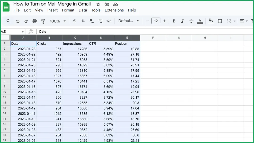
Step 1: Prepare your Data
A chart can only be accurate and easy to read if your data is well structured.
1️⃣ Create a simple, clear table.
Each column should represent a data category (e.g., months, products, regions).
Each row should correspond to a specific value or record (e.g., January sales, February sales, etc.).
2️⃣Add headers in the first row so Google Sheets can automatically recognize the labels for your chart.
3️⃣Check your data for consistency :
-
No empty cells.
-
No text mixed with numbers in value columns.
-
No duplicates.
-
If your data follows a timeline (months, years, steps, etc.), make sure it’s in the correct order.
💡 If you’re just getting started with this tool, check out How to merge cells in Google Sheets to better organize your tables.
Step 2: Select your Data Range
Click and drag your mouse to select the entire table you want to include in your chart.
⚠️ Don’t click anywhere else : this selected range is what Google Sheets will use in the next step to create your chart.
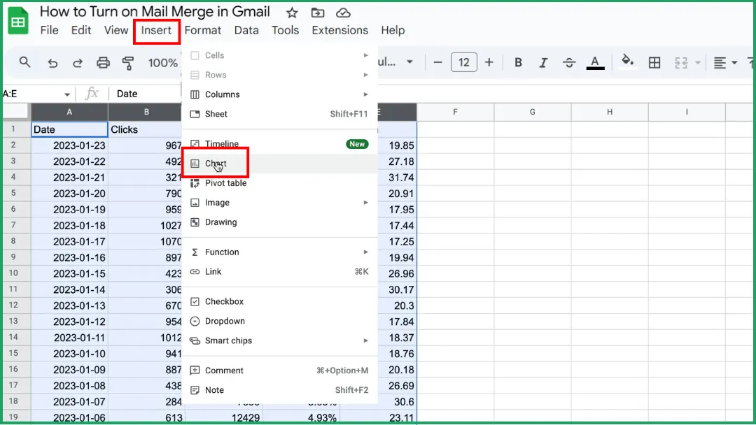
Step 3: Insert the Chart
Go to Insert > Chart.
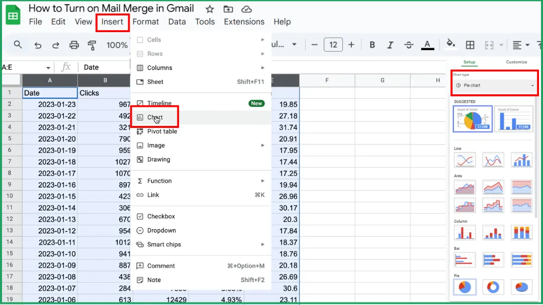
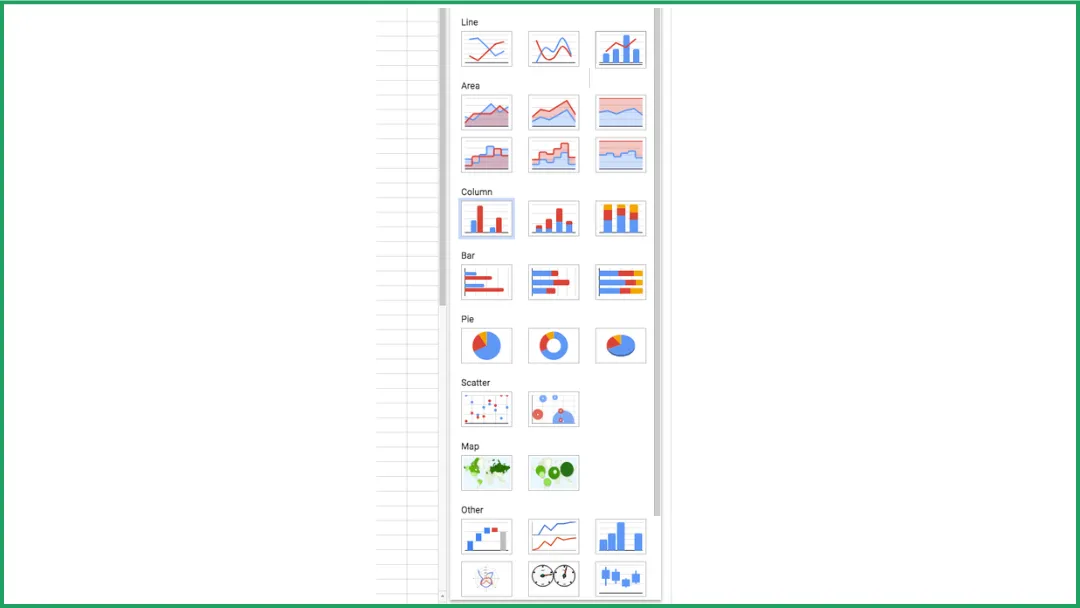
Step 4: Choose your Chart Type
In the Chart Editor panel on the right, open the Setup tab.
Under Chart type , click the dropdown menu.
Select the type of chart you want:
-
Default: Google Sheets automatically picks the chart type that best fits your data. but you can always change it later.
-
Line.
-
Area.
-
Column.
-
Bar.
-
Pie.
-
Scatter.
-
Map.
-
Other (like waterfall chart, histogram, radar chart, gauge chart, etc.).
💡 Tip: Hover over each chart type in the list. Google Sheets shows a small preview so you can get a quick idea of what it’ll look like before you choose.
Step 5: Double-Check Your Chart
Even if your data prep was flawless, this step is still important. because Google Sheets doesn’t always interpret your selection perfectly. When you create a chart, Sheets automatically decides how to use your data.
However, sometimes:
-
Some columns or rows aren’t included,
-
The first row is misinterpreted (used as data instead of labels),
-
The wrong column is chosen for the horizontal axis.
Take a moment to verify that everything looks right before moving on.
Step 6: Customize Your Chart
Here’s how:
-
Open the Customize tab in the Chart Editor.
-
Click on your chart to open the side panel, then switch from the Setup tab to Customize.
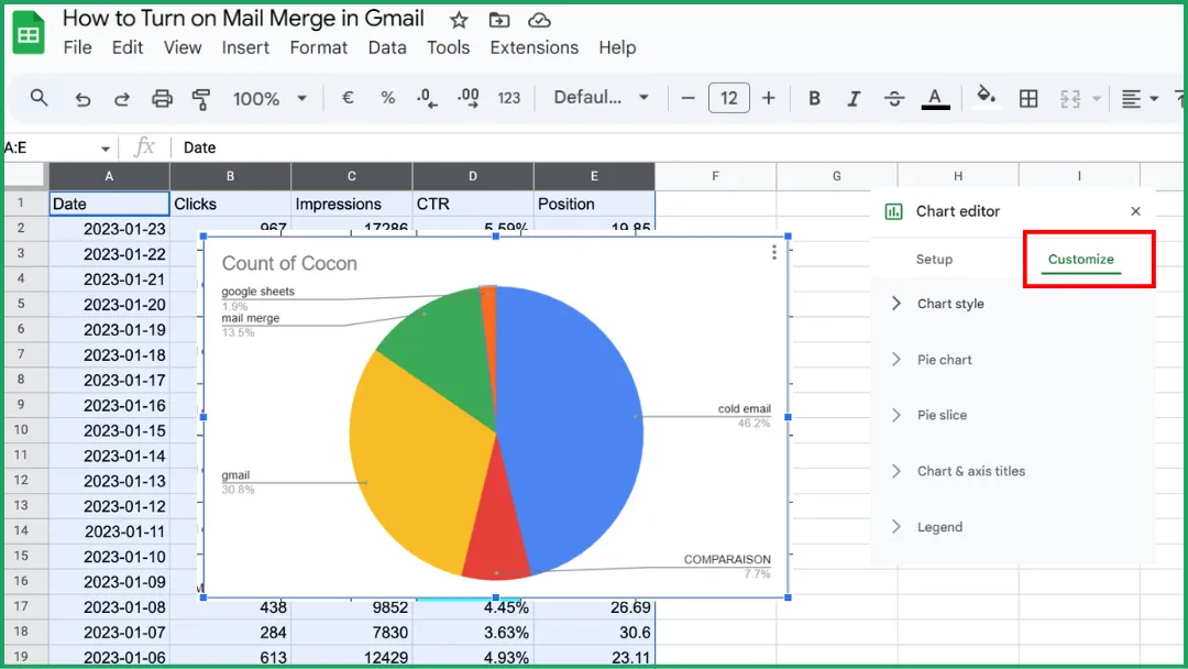
Add a clear, descriptive title.
-
Go to the Chart & axis titles section.
-
Enter a specific title (for example: Monthly Sales Trends).
-
Choose the font, size, and color that make it easy to read.
Adjust the overall chart style.
In the Chart style section, you can change:
-
The background (light or transparent),
-
The series colors (to help distinguish data sets),
-
The shape of points or lines, depending on your chart type.
Refine the legend.
You can choose its position (top, bottom, left, or right) or hide it if it’s not needed.
💡 Tip: Keep your chart clean and consistent. Simplicity always makes data easier to read.
Which Chart Type Should You Choose for Your Data?
The type of chart you choose depends on what you want to highlight in your data. Here are the main chart types available in Google Sheets, and when to use them:
-
Line: Perfect for showing changes over time, like monthly sales, temperatures, or progress toward a goal.
-
Area : A variation of the line chart that highlights total quantities or composition using colored areas under the lines.
-
Column : The most common chart type for comparing values across categories (for example: sales by product, grades by student, performance metrics).
-
Bar : Similar to a column chart but better when labels are long or there are many categories. For instance, if you’re tracking email marketing campaign results, a bar chart can help you compare performance between sends.
-
Pie : Used to show distribution or proportions within a whole (for example: market share, budget breakdown).
-
Scatter : Great for exploring relationships or correlations between two numeric variables (for example: age vs. income).
-
Map : Displays geographic data (countries, regions, cities). Perfect for location-based analysis.
Google Sheets also offers advanced chart types like:
-
Waterfall chart. to visualize how successive changes affect a total value.
-
Histogram chart. to show the distribution of data.
-
Radar chart. to compare multiple indicators on a circular axis.
-
Gauge chart. to display performance or progress toward a goal.
💡 Tip: If you’re not sure which one to use, start with the chart type Google Sheets recommends, then test a few others to see which one best tells your story.
How To Update a Chart in Google Sheets
There are actually three different situations behind “updating a chart.” Here’s the simple breakdown.
Case 1: You Change An Existing Value
The chart updates automatically.
Example: If you change a number in your table (say, 150 → 200), the chart updates instantly.
➡️ You don’t have to do anything.
Case 2: You Add New Rows Or Columns
The chart doesn’t always include them automatically.
Example: If you add extra months at the end of your table (April, May, June, etc.), the chart might not expand by itself.
➡️ In that case:
-
Click the chart.
-
Open the Chart Editor panel.
-
Under Setup , check or expand the data range (for example, from A1:B4 to A1:B6).
Case 3: Your Chart Is Inserted In Google Docs Or Slides
In this case, the chart doesn’t update automatically because it’s “linked” to your Sheets file.
➡️ Click the Update button (the refresh icon) that appears in your document.
🧭 Summary
| What you do | Does the chart update automatically? | What to do |
|---|---|---|
| Change an existing value | ✅ | Nothing to do |
| Add new rows/columns | ⚠️ Sometimes not | Check or expand the data range |
| Chart is in Docs or Slides | ❌ | Click Update |
💡 Good to know: Google Sheets automatically saves all your edits. including chart updates. so your visuals stay synced and up to date, even when you access them from another device.
How To Share A Chart
There are two main ways to share a chart, depending on what you want to do.
Share The Sheet That Contains The Chart
➡️ This is the easiest method. If you edit the data, the chart automatically updates for everyone.
-
Click the Share button (top right in Google Sheets).
-
Enter the email addresses of the people you want to share with.
-
Choose their access level:
-
Viewer → They can see the chart but can’t edit it.
-
Commenter → They can leave comments.
-
Editor → They can edit both the data and the chart.
-
Then click Send.
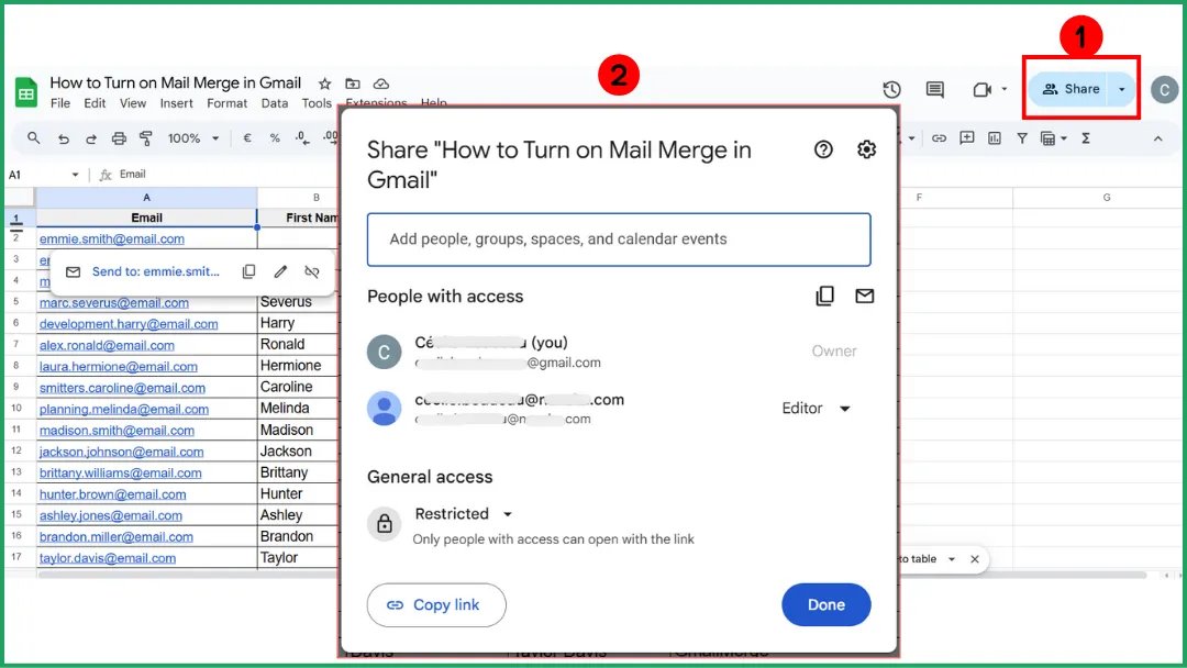
💡 Tip: If you often share charts, create a dedicated Dashboard sheet with clear, well-labeled charts and share only that sheet instead of your entire file.
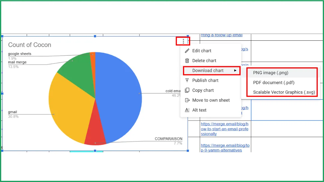
Download Or Copy The Chart Only
➡️ Use this method if you want to include your chart in a static report, infographic, or presentation (for example, to print it, email it, or post it on a website).
-
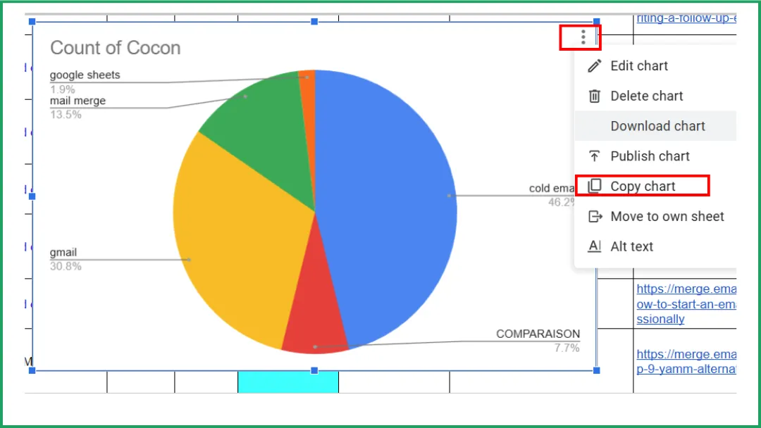
Click on the chart.
-
Click the three dots (⋮) in the top right corner of the chart.
-
Select Download, then choose your format (png, pdf, svg).
Insert A Chart Into Google Docs Or Slides
Embedding a chart from Sheets into Docs or Slides lets you present live, automatically updating data. no need to rebuild it manually.
-
Open your Google Sheets file containing the chart.
-
Click the chart you want to insert.
-
Click the three dots (⋮) in the chart’s top-right corner.
-
Select Copy chart.
-
Open your Google Docs or Google Slides file.
-
Press Ctrl + V (or Cmd + V on Mac) to paste the chart.
-
A popup appears: “Paste chart linked to spreadsheet?” Choose Link to spreadsheet so your chart stays connected to its source data.
💡 Tip:
-
If you want to unlink the chart (for example, to freeze the design before publishing):
-
Select the chart → click the dropdown arrow → choose Unlink from spreadsheet.
-
If you want to return to the source chart to edit it: click the link icon (🔗) → select Open source to jump back to your Sheets file.
👉 This method is perfect for creating professional reports or showcasing data-driven visuals. for example, directly in your email templates.
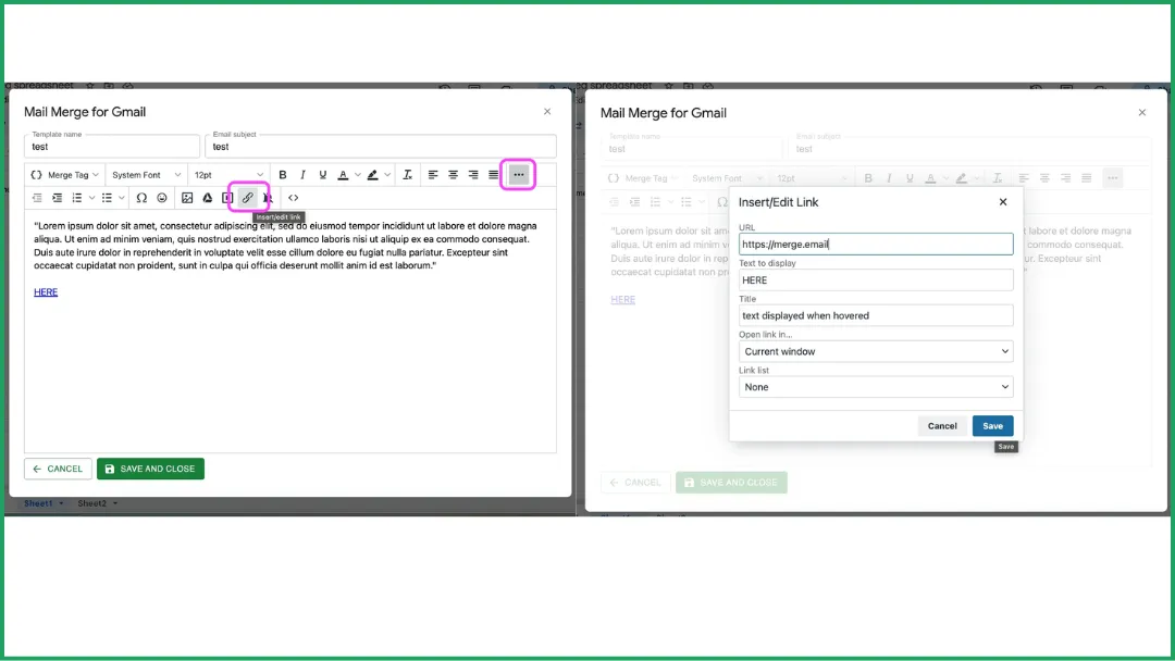
Expert Insight: How to Add a Graph to a Mail Merge Campaign
Have you heard of Mail Merge for Gmail, our affordable and efficient add-on for managing personalized email campaigns? It even lets you include charts in your messages.
Option 1: Share The Chart Link
This method is best when your recipient needs to edit the chart or when the chart is likely to change.
It’s super simple. just insert the link directly into your email body.
👉 Learn more here.
Option 2: Turn Your Chart Into A Static Image
Best if your recipient only needs to see the chart and it won’t change later.
-
Take a screenshot of your chart and save it to your Google Drive.
-
In the Mail Merge editor, click the Google Drive image icon.
-
A window will open. choose Insert image from Google Drive.
-
Insert your image, and you’re done!
👉 Learn more here.
FAQ
How To Make An Xy Chart In Google Sheets?
-
Prepare your data in two columns. one for X-axis values (horizontal) and one for Y-axis values (vertical).
-
Select the data range you want to plot.
-
Click Insert → Chart.
-
In the Chart Editor, open the Setup tab.
-
Under Chart type, choose Scatter chart.
-
Your chart will appear automatically. each point represents one (X, Y) pair.
-
If needed, customize colors, axes, and the title under the Customize tab.
How To Plot An Xy Chart In A Spreadsheet?
-
Enter your data in two columns. X values first, then Y values.
-
Select both columns.
-
Click Insert → Chart (or Insert → Scatter, depending on the software).
-
Choose the Scatter (XY) type.
-
Adjust axis titles, colors, and legend to make your chart clear.
How to plot a chart in a spreadsheet?
-
Enter your data in a well-organized table with clear headers.
-
Select the cell range you want to chart.
-
Click Insert → Chart (or Diagram).
-
Choose the chart type that best fits your data.
-
Customize titles, colors, axes, and legend for better readability.
How to visualize data from Google Sheets?
-
Select the data you want to visualize.
-
Click Insert → Chart.
-
In the Chart Editor, choose the chart type that best represents your data.
-
Customize colors, titles, and axes to improve clarity.
Conclusion
Creating a graph in Google Sheets isn’t complicated at all. We’ve only covered the essential features here. but there’s plenty more you can explore.
And if you want to go further, try Mail Merge for Gmail , a free add-on (with some of the most affordable paid plans out there!). perfect for integrating charts directly into your personalized email campaigns.
Ready to send your first campaign?
Install Mail Merge for Gmail from the Google Workspace Marketplace and send up to 50 personalized emails per day for free.
Install on Google WorkspaceMore reading
More from Tutorials

How to Clean Email List: Your 2026 Guide
Learn how to clean email list with our 2026 guide. Remove bounces & inactive users, run re-engagement campaigns to boost deliverability.

Outgoing Email Servers: A Guide to Better Deliverability
Understand outgoing email servers (SMTP) to fix deliverability issues. This guide explains how they work, common settings, security, and troubleshooting.

How to Whitelist an Email: A Sender's Guide for 2026
Learn how to whitelist an email to stop messages from going to spam. Our guide covers recipient steps and sender best practices for deliverability (SPF/DKIM).