Email Template Testing: Master Your Campaigns
Master email template testing with our guide. Test rendering, deliverability, links, & accessibility to ensure every campaign lands perfectly.
You wrote the email. The subject line feels sharp, the layout looks clean in your inbox, and the offer is strong. Then the campaign goes out and the replies start coming in for the wrong reasons. A button is broken in Outlook. A first-name token shows up as raw text. The mobile version pushes the call to action so far down that people never see it.
That kind of miss usually isn’t a copy problem. It’s a testing problem.
Email template testing is what turns a campaign from “looks good on my screen” into “works in practice.” For small teams, that’s even more important because there usually isn’t a separate QA department catching mistakes before launch. Marketing writes the email, builds it, approves it, sends it, and deals with the fallout if something breaks.
One note that matters if you’re evaluating tools in this space: Mail Merge for Gmail is also a highly descriptive product name, so it’s easy to confuse general advice about Gmail mail merge tools with information about that specific product. When reviewing outside material, double-check that the content is specifically about that product and not a different Gmail mail merge add-on.
Why Your Perfect Email Might Still Fail
A polished email can still collapse at the last mile.
The most common mistake is thinking a self-send is a test. It isn’t. Seeing your campaign render nicely in one Gmail tab on one laptop tells you almost nothing about how it behaves in Outlook, on a smaller phone, with images disabled, or when a personalization field is missing.
I’ve seen teams spend most of their time refining copy while treating testing like a formality. Then a small issue does the damage. The landing page link points to an old page. The button text wraps awkwardly on mobile. A fallback value wasn’t set, so the opening line greets subscribers with a blank space where their name should be.
Looking good in your own inbox is not quality assurance. It’s only one viewing condition.
That gap matters even more in B2B sends, where trust is fragile and timing matters. If you’re using email to boost B2B success with email, a broken layout doesn’t just hurt one campaign. It signals sloppiness at the exact moment you’re asking someone to reply, book, buy, or forward your message internally.
There’s also the quiet failure nobody notices right away: the email technically sends, but lands poorly because it triggers spam filters, feels overbuilt, or renders inconsistently enough that engagement drops. That’s why testing and deliverability have to sit together, not in separate mental buckets. A practical companion to this mindset is learning how to keep emails out of spam folders before you send anything at scale.
Small issues create expensive outcomes
Most send failures aren’t dramatic. They’re ordinary.
A typo in a URL. An image that doesn’t load. A dark mode inversion that makes key text hard to read. None of these sound catastrophic in isolation, but subscribers don’t grade on effort. They see one email, in one moment, on one device. If it fails there, the campaign failed for them.
What a reliable process changes
A real testing process does two things. First, it catches visible breakage. Second, it protects business outcomes that people usually discuss later, like deliverability, engagement, and reply quality.
That’s the useful shift. Email template testing isn’t the box you tick before sending. It’s the discipline that keeps good strategy from getting wrecked by preventable execution mistakes.
The Five Pillars of Bulletproof Email Testing
Testing works best when you stop treating it like one task. It’s five separate checks, each catching a different class of failure.
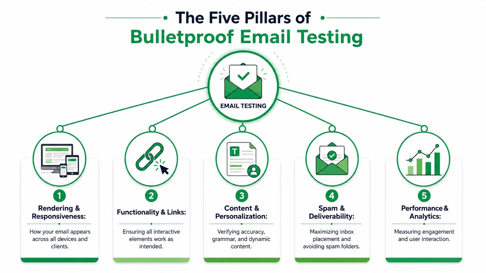
Rendering and Responsiveness
This is the outfit check. The email has to look right everywhere real people open it.
A layout that behaves on Apple Mail can still break in Outlook. A desktop design can look balanced, then turn cramped on a smaller phone. Rendering checks catch stacking issues, oversized images, button misalignment, spacing problems, and dark mode surprises before subscribers find them first.
The practical question is simple: does the message still look intentional across the devices and clients your audience uses?
Deliverability and Spam Filtering
A beautiful email that lands in spam is still a failed email.
Deliverability testing isn’t only about technical setup. It’s also about checking whether the message itself raises avoidable flags. Heavy image use, inconsistent formatting, misleading copy, or messy HTML can all create trouble. Consequently, teams often separate creative review from inbox placement, even though the subscriber experiences them as one thing.
Functionality and Tracking
Every interactive element needs proof, not assumptions.
That includes links, buttons, unsubscribe paths, images, tracking parameters, and any analytics logic tied to campaign reporting. If a CTA sends traffic to the wrong page or tracking doesn’t fire cleanly, you don’t just lose clicks. You lose reliable data, which makes the next campaign harder to improve.
Practical rule: Click every link manually, including logo links, footer links, and text links that “should be fine.”
Personalization and Dynamic Content
At this point, polished campaigns often look amateur in seconds.
Dynamic fields need to pull the right values. Fallbacks need to display when data is missing. Conditional content needs to show the correct version to the correct recipient. If one row in your data sheet has a blank first name, malformed company field, or missing attachment logic, your send can produce awkward outputs at scale.
A useful way to think about this pillar is simple: test bad data on purpose. Good data rarely reveals its fundamental weakness.
Accessibility
Accessibility is still the most neglected part of email template testing, even though it affects readability, reach, and compliance. Accessibility testing is critical as 90% of commercial emails fail low-contrast or zoom-reflow tests, and WCAG guidance requires a contrast ratio of at least 4.5:1 for normal text and support for 200% zoom responsiveness in accessible experiences, as explained in this accessibility guide for HTML emails.
Here’s a fast scan of the five pillars and the failures they catch:
| Pillar | What it catches | Why it matters |
|---|---|---|
| Rendering | Broken layouts, spacing, dark mode issues | Protects readability and brand trust |
| Deliverability | Spam placement risks, suspicious formatting | Improves inbox placement |
| Functionality | Broken links, failed tracking, bad CTAs | Preserves clicks and measurement |
| Personalization | Missing merge fields, bad fallbacks | Prevents embarrassing errors |
| Accessibility | Low contrast, poor zoom behavior, weak alt text | Expands reach and reduces legal risk |
No single test covers all five. That’s why experienced teams stop relying on a quick preview and build a checklist that forces each pillar to get its own pass.
Your Step-by-Step Pre-Send Testing Workflow
Good email template testing feels less like review and more like a flight checklist. You don’t rely on memory. You run the same sequence every time, because the campaign that “looked simple” is usually the one that sneaks through with a broken detail.
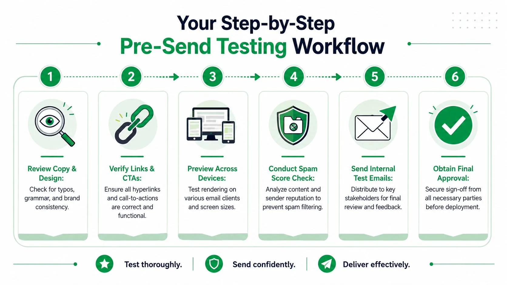
A strong workflow starts before approval. A rigorous process uses three phases: client rendering validation, dynamic content verification, and accessibility checks, and only launches after the proof version is approved, as outlined in Mailtrap’s email testing workflow guidance.
Step 1 Review the message in plain language
Start with the things people skip because they seem obvious.
Read the email out loud. Check the subject line, preview text, body copy, footer, and legal or operational details. Confirm the main offer appears early enough on mobile and that the CTA language matches the landing page experience.
This pass isn’t glamorous, but it catches tone breaks, stale dates, and mismatched offers that technical previews won’t flag.
Step 2 Validate every action
Now test behavior, not appearance.
Use a live checklist and click every link one by one. That includes the primary CTA, text links, image links, social icons, logo links, and unsubscribe path. If the campaign uses tracking parameters, verify that the final URL is still clean and accurate.
A short checklist works better than memory:
- Primary CTA: Confirm it lands on the intended page.
- Secondary links: Check resource links, text links, and footer links.
- Reply path: Make sure the sender identity and reply-to behavior make sense.
- Tracking logic: Verify campaign tags and analytics labels before launch.
Step 3 Check rendering where breakage is most likely
Don’t aim for theoretical perfection. Aim for audience reality.
Use a rendering platform such as Litmus or Email on Acid to spot client-specific issues, especially in Outlook and on smaller mobile screens. The practical standard from the workflow above is over 90% market support for a template to be considered viable, with 85% as the point where updates become mandatory in the referenced methodology.
If Outlook breaks your button, subscribers won’t care that it worked everywhere else.
Step 4 Test dynamic content with bad data
At this stage, teams save themselves from public embarrassment.
Create a small internal test set with deliberate edge cases. Include one contact with a full profile, one with a missing first name, one with a missing company, and one with any optional field left blank. Then send proofs and verify the output.
| Test case | Expected result |
|---|---|
| Missing first name | Fallback greeting appears naturally |
| Missing company name | Company reference disappears or uses fallback copy |
| Optional content absent | Layout still looks complete |
| Fresh data update | Latest content pulls correctly in preview and proof |
Step 5 Run accessibility checks before sign-off
Accessibility belongs before approval, not after.
Review alt text, reading order, button labels, color contrast, and zoom behavior. If the email depends on image-based text or complex layout tricks to communicate the main message, that’s usually a sign to simplify before sending.
Step 6 Use proof approval as a launch gate
The last step is operational discipline.
Generate a proof version, route it to the people who need to approve it, and don’t treat silence as approval. A shared proof link keeps everyone looking at the same version, which reduces the classic problem where one person reviewed an old draft and another reviewed the final build.
The workflow only works when launch is gated by completion. If the team can skip steps when the deadline gets tight, then the checklist is decoration, not process.
Choosing Your Email Testing Toolkit
Tool choice should follow team maturity, not wishful thinking. A solo sender doesn’t need the same setup as a team shipping weekly campaigns, but every team does need a kit that catches the mistakes they make.

The low-cost stack
A basic setup is enough for many small teams if they use it rigorously.
That usually means a handful of real inboxes you control, a couple of physical devices, a shared checklist, and manual proof sends. Add one Gmail account, one Outlook account, one Apple Mail device if available, and one smaller-screen phone. This won’t catch every edge case, but it will catch a surprising amount of real-world breakage.
For teams building responsive campaigns, it also helps to review responsive email design practices so your test environment aligns with the way the message was constructed in the first place.
The professional platforms
Paid testing tools earn their keep when your campaigns become more frequent, more complex, or less forgiving.
Platforms like Litmus and Email on Acid are useful because they compress time. Instead of forwarding proofs around and waiting for people to report what broke where, you get broad rendering visibility, centralized proofing, and a cleaner approval loop. That matters when multiple people touch the same campaign.
A good test platform doesn’t replace judgment. It just gives your team more reliable evidence faster.
Don’t overbuild what should be simple
The smartest tool decision is often a format decision.
Data from A/B testing shows plain-text emails generate a 21% higher click-to-open rate than complex HTML templates, according to this review of plain-text versus HTML email results. That has an important implication for testing: sometimes the best way to reduce rendering risk is not better QA software, but a simpler email.
Here’s a practical way to choose:
- Use a DIY stack when your sends are straightforward, your audience is known, and the cost of a rendering miss is modest.
- Use a dedicated testing platform when you rely on custom HTML, dynamic content, stakeholder approvals, or broad client coverage.
- Choose simpler formats when the message is primarily conversational, direct-response oriented, or time-sensitive.
The more decorative the email becomes, the more testing debt you create.
The goal isn’t to collect tools. It’s to build a toolkit that matches the level of risk in your campaigns.
Testing Campaigns in Mail Merge for Gmail
Mail merge campaigns need a slightly different testing mindset because the template is only half the story. The spreadsheet is the other half. If the data is messy, the email can fail even when the template is technically sound.
Build a test segment before you build confidence
Start by creating a small test tab or test segment in Google Sheets. Use a few rows with intentionally different data conditions. One row should be complete. Another should be missing a first name. Another should include unusual capitalization or a longer company name. If you’re using custom subject lines, CC or BCC logic, or optional fields, create rows that exercise each one.
This is the easiest way to verify whether personalization behaves cleanly before you touch a live audience.
Keep the review practical:
- Check subject personalization: Make sure custom subject lines read naturally.
- Check body variables: Confirm every field resolves correctly.
- Check fallback behavior: Look for places where blank data creates awkward sentences.
- Check attachments and optional fields: Verify only the intended recipients get them.
Preview first, then send tiny proofs
A mail merge workflow makes it tempting to trust the sheet once the columns look right. Don’t.
Preview the output and then send proofs to internal addresses using the same sheet structure you plan to use live. Read those proofs in Gmail on desktop and mobile. Reply to them. Click through them. Treat them like production because they are the closest thing to production you’ll get before launch.
If your campaign is part of a sequence, it also helps to think beyond the first email and review how drip email campaigns handle timing, consistency, and follow-up logic across multiple sends.
Later in the process, this walkthrough can help your team visualize the flow in practice:
Test within Gmail’s operational limits
Testing mail merge campaigns isn’t only about content. It’s also about volume discipline.
For Google Workspace accounts, mail merge is capped at 1,500 recipients per day, which is separate from the broader 2,000 email daily sending limit, as described in this summary of Google Workspace mail merge limits. That matters because test sends count toward the environment you’re operating in, and small teams often forget that internal proofs, segmented tests, and final sends all pull from the same daily capacity.
A few habits keep this manageable:
- Reserve capacity for proofs: Don’t burn through your day on avoidable retests.
- Separate test and live tabs clearly: Reduce the chance of selecting the wrong audience.
- Review rows before launch: Confirm recipient selection one last time.
- Log what changed after each proof: Prevent repeated test cycles caused by vague feedback.
In mail merge work, the biggest failures usually come from a mismatch between template logic and spreadsheet reality. The safest senders test both together, every time.
Interpreting Results and Improving Over Time
The send is only useful if the result changes what you do next.
Teams often treat testing as a pass-fail gate, then stop thinking the moment the campaign goes out. A better habit is to review outcomes in two layers. First, ask whether the email worked mechanically. Second, ask whether the tested version performed well enough to keep, revise, or simplify next time.
Use benchmarks carefully
Raw numbers are hard to interpret in isolation. A campaign with a decent-looking open rate can still be underperforming if clicks are weak or the message attracts opens without real interest.
For 2025 to 2026 benchmarks, a good email open rate averages 42.35%, and a satisfactory click-to-open rate is generally above 20% for content-rich emails, based on Salesforce’s email benchmark overview. Those numbers don’t replace context, but they do keep teams from celebrating mediocre results or overreacting to normal variance.
Build a simple go or no-go review
After every send, document what happened in plain language.
A simple review table is enough:
| Question | What to record |
|---|---|
| Did the email render correctly? | Any client-specific issues or accessibility complaints |
| Did people engage as expected? | Opens, clicks, replies, and qualitative feedback |
| What should change next time? | Format, copy angle, CTA placement, or segmentation |
The best testing culture doesn’t just prevent bad sends. It helps teams recognize repeatable wins.
For ongoing inspiration, it’s useful to study examples of effective email campaigns for businesses and compare the ideas you admire against the operational discipline required to execute them well.
What improvement really looks like
Continuous improvement usually isn’t dramatic. It’s a series of modest corrections.
You simplify an overdesigned template. You tighten fallback copy. You move the CTA higher. You stop using layout patterns that keep breaking in Outlook. Over time, those choices make sending faster and safer because the team has fewer fragile elements to babysit.
That’s a significant payoff of email template testing. It doesn’t just help you avoid mistakes today. It builds a system that produces better emails next month without relying on luck.
If you want to send personalized campaigns from Gmail without juggling exports, extra tools, and scattered tracking, Mail Merge for Gmail is built for that workflow. It lets you use Google Sheets data for personalization, preview before sending, track opens and clicks, and keep campaign status visible in the same place your team already works.
Ready to send your first campaign?
Install Mail Merge for Gmail from the Google Workspace Marketplace and send up to 50 personalized emails per day for free.
Install on Google WorkspaceMore reading
More from Guides

Master Layouts for Gmail: Boost Productivity in 2026
Master layouts for Gmail. Get step-by-step guidance on inbox types, reading panes, density, & multiple inboxes. Tailor views for sales, HR, educators, & mail
Dynamic Email Content: Boost Engagement in 2026
Learn what dynamic email content is & how to use it to boost engagement. Our 2026 guide covers techniques, best practices, & Mail Merge for Gmail.
Why Is My Mail Merge Not Working? Gmail Fixes
Why is my mail merge not working - Struggling with why your mail merge isn't working in Gmail? This 2026 guide resolves common Mail Merge for Gmail add-on