Responsive Email Design: A Practical How-To Guide for 2026
Learn responsive email design with our step-by-step guide. Master fluid layouts, CSS for Gmail & Outlook, and send pixel-perfect campaigns from Gmail.
More than 70% of emails were opened on mobile devices in 2025, according to Groupmail’s responsive email guide. That single shift changed the job of email design. You’re no longer polishing a desktop layout and hoping it survives on a phone. You’re building for the narrowest screen, the least forgiving client, and the fastest possible thumb scroll.
That’s why responsive email design matters so much in practice. It isn’t a visual trend. It’s the difference between an email that gets read and one that gets deleted before the reader reaches your headline.
I’ve found that many teams don’t struggle with the idea of responsive email. They struggle with the implementation. They know they need a mobile-friendly layout, but they’re still dealing with Outlook quirks, CSS support gaps, dark mode surprises, and the fact that they may want to send from Gmail instead of a heavyweight ESP. That’s the gap this guide closes.
Why Responsive Email Design Is Non-Negotiable in 2026
A desktop-first email is now the higher-risk build. On a phone, readers decide in seconds whether your message is easy to read, easy to tap, and worth their time.
As noted earlier, mobile now accounts for the majority of email opens. That changes the standard for what counts as a usable campaign. An email that looks acceptable on a large screen can still fail in the inbox that matters first, especially if it arrives through Gmail and needs to hold up without the guardrails of a large ESP.
The cost shows up fast. Groupmail reports that emails which are not mobile-friendly are often deleted, and mobile-responsive templates can lift mobile clicks. That lines up with what email developers see in production. If the first screen feels cramped or broken, the reader does not wait for the message to recover.
What failure looks like on a phone
On desktop, readers can sometimes work around a bad layout. They can scan across a wider canvas, recover from awkward spacing, and click with more precision.
Phones are less forgiving.
- Tiny body copy forces zooming and slows reading.
- Multi-column sections stack badly or stay too narrow to read.
- Small buttons create missed taps and lower conversion rates.
- Large hero images push the main message too far down the screen.
I use a simple check during build review. If the main CTA is not obvious within a quick thumb scroll, the email needs work. That standard matters even more for teams sending polished HTML through Gmail mail merge tools, where a clean structure has to do more of the heavy lifting than platform automation.
Responsive design protects performance, not just appearance
A responsive build improves more than aesthetics. It protects hierarchy, keeps line lengths readable, and gives buttons enough space for touch input. It also reduces the chance that a layout falls apart in stubborn clients such as Outlook, where every extra flourish increases the testing burden.
That trade-off matters in 2026. Fancy layouts can look impressive in a browser preview and still create avoidable problems in real inboxes. A simpler responsive structure usually wins because it is easier to code, easier to test, and more dependable when you send it at scale or directly from Gmail.
Email still produces strong returns as a channel. A 2025 roundup cited by Tabular says email marketing returns about $36 for every $1 spent. With that kind of upside, responsive execution is not a polish step. It is part of the delivery process.
The practical baseline is clear:
- Build for a narrow screen first.
- Assume touch input.
- Keep the primary action visible early.
- Expect uneven CSS support.
- Choose patterns you can test and send reliably, including through Gmail-based workflows.
Choosing Your Responsive Layout Approach
Before you touch HTML, choose the layout philosophy. That decision shapes everything that follows, from code complexity to testing time.
Many teams overcomplicate this part. They reach for a clever multi-column promo layout when a plain single-column structure would have performed better and broken less often. That’s especially true when their audience includes Outlook-heavy corporate inboxes.
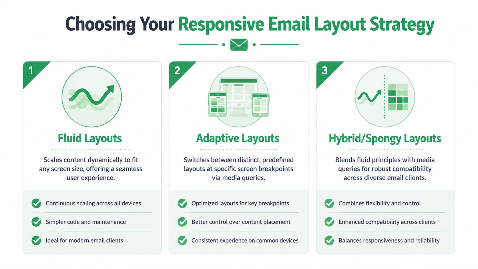
Three layout strategies that matter
You’ll usually hear three approaches discussed in email development.
| Approach | How it behaves | Where it works well | Where it gets tricky |
|---|---|---|---|
| Fluid | Elements scale with available width | Simple newsletters, alerts, text-heavy emails | Can feel too loose without strong width control |
| Adaptive | Uses distinct layouts at breakpoints | Campaigns with more controlled desktop/mobile variants | Depends more heavily on media query support |
| Hybrid or spongy | Mixes fluid structure with selective responsive behavior | Teams that need broad client resilience | More setup work and more edge cases to test |
Fluid is the easiest mental model. The content stretches and shrinks naturally. For straightforward emails, that’s often enough.
Adaptive gives you more control. You define how the email should behave at specific widths. That’s useful when desktop and mobile need visibly different treatments.
Hybrid sits in the middle. It’s often the most practical route for production email because it tolerates weaker client support better than a media-query-heavy design.
Choose based on audience, not elegance
The strongest layout is the one your audience’s inboxes can render consistently.
OneSignal’s guidance on responsive email design makes an important point: many clients, especially versions of Outlook, have weak support for complex layouts. In some cases, a simpler single-column design creates a better and more consistent experience than a more ambitious responsive build.
That’s exactly right. I’d choose a stable single-column email over a fragile two-column layout every time if the audience is dominated by desktop Outlook users.
Broken sophistication loses to plain reliability.
A practical decision framework
Use this when selecting a layout approach:
- Pick single-column first if the email is mostly copy, one hero image, and one main CTA.
- Use fluid or hybrid if you want responsive behavior without betting everything on media queries.
- Use adaptive carefully when you control design resources and can test thoroughly across key clients.
- Avoid decorative complexity when your list includes a lot of Outlook or mixed enterprise environments.
What usually works best
For many, the winning formula is still boring in the best way:
- a single-column body
- one clear visual hierarchy
- one primary CTA
- minimal layout tricks
That structure doesn’t just survive more clients. It also makes writing the email easier, because the content has to stand on its own without relying on fancy arrangement to carry it.
Building Your Core HTML Structure
Desktop still does a lot of the heavy lifting in email, especially for B2B sends, and that changes how the HTML should be built. The safest starting point is a centered table container that stays readable on large screens and collapses cleanly on mobile. In practice, that usually means a single-column email capped around 600 to 640px.
That width has held up for years because it gives you enough room for type, buttons, and images without forcing horizontal scroll in tighter desktop preview panes. It also maps well to a workflow where you build once, test across major clients, then send through a simple tool stack such as Gmail with Mail Merge instead of a full ESP.
Start with the right container
Use a full-width outer wrapper for background color and centering. Then place your actual email inside a constrained inner table.
<!DOCTYPE html>
<html lang="en">
<head>
  <meta charset="utf-8">
  <meta name="viewport" content="width=device-width, initial-scale=1.0">
  <meta http-equiv="x-ua-compatible" content="ie=edge">
  <title>Email</title>
</head>
<body style="margin:0; padding:0; background-color:#f4f4f4;">
  <table role="presentation" width="100%" cellspacing="0" cellpadding="0" border="0" style="border-collapse:collapse; width:100%; background-color:#f4f4f4;">
    <tr>
      <td align="center" style="padding:24px 12px;">
        <table role="presentation" width="100%" cellspacing="0" cellpadding="0" border="0" style="border-collapse:collapse; max-width:640px; background-color:#ffffff;">
          <tr>
            <td style="padding:32px 24px; font-family:Arial, sans-serif; font-size:16px; line-height:1.5; color:#222222;">
              Your content goes here.
            </td>
          </tr>
        </table>
      </td>
    </tr>
  </table>
</body>
</html>
This base structure solves four common problems early:
- Predictable layout rendering in clients that still depend on table logic
- Safe centering without fragile CSS positioning
- Readable line length on desktop
- A clean shell for Gmail-friendly sending workflows, where simple, durable markup matters more than clever front-end techniques
Add Outlook support while the layout is still simple
Outlook on Windows can ignore or reinterpret CSS that works fine elsewhere. I do not wait for testing to expose that. I add the Outlook wrapper as soon as the container is in place, because retrofitting it later is slower and usually messier.
A ghost table gives Outlook a fixed-width structure while other clients use the standard container.
<!--[if mso]>
<table role="presentation" width="640" align="center" cellspacing="0" cellpadding="0" border="0">
  <tr>
    <td>
<![endif]-->

<table role="presentation" width="100%" cellspacing="0" cellpadding="0" border="0" style="border-collapse:collapse; max-width:640px;">
  <tr>
    <td style="padding:24px;">
      Main content block
    </td>
  </tr>
</table>

<!--[if mso]>
    </td>
  </tr>
</table>
<![endif]-->
It is plain HTML. That is the point.
If your audience includes company domains, procurement teams, or internal newsletters, Outlook support belongs in the first draft. It should not be a rescue job after approval.
Build sections as independent blocks
Treat each major section as its own row or nested table. That makes edits safer and testing faster.
A practical block order looks like this:
- Hero area
- Intro copy
- CTA block
- Secondary content
- Footer
This structure pays off when you need to swap content for different recipients before sending from Gmail with Mail Merge. You can replace a hero, remove a secondary block, or shorten a footer without destabilizing the whole message.
If you want a fast starting point, a table generator for Gmail email layouts can produce the skeleton. I still clean up spacing, widths, and inline styles by hand before sending.
Keep version one boring
The first pass should prove the structure, not show off the design system.
Get the container, spacing, copy blocks, and button table working first. Check that images scale, links are tappable, and the body remains readable with images off. Once that foundation survives Gmail, Apple Mail, and Outlook, then it makes sense to add more ambitious pieces such as multi-column product rows or section-specific backgrounds.
Plain markup travels better across inboxes. That matters even more when the final send happens through accessible tools instead of a large ESP, because your HTML has to carry more of the reliability on its own.
Mastering CSS for Inconsistent Email Clients
Email CSS breaks for a simple reason. Inbox apps are not working from the same rendering engine, and Outlook on Windows still behaves more like a Word document than a browser.
That changes how responsive email gets built. The job is not to write the cleanest modern CSS. The job is to ship HTML that still looks right after Gmail strips parts of the head, Apple Mail enhances what it can, and Outlook ignores what it never supported.
Start with CSS that survives weak clients
The safest styling choices are old, repetitive, and proven in production. Use inline styles for anything tied to readability or layout. Keep widths explicit. Use HTML attributes as backup where they still help. A width attribute on a table cell or image often saves a design when a client gets selective about CSS.
A dependable example looks like this:
<td width="100%" style="width:100%; padding:24px; font-family:Arial, sans-serif;">That duplication is intentional. In browser work, it feels unnecessary. In email, it reduces surprises.
I treat this the same way I treat logos or email signature icons that need to stay sharp and aligned in Gmail. The markup has to carry its own fallback plan.
Inline CSS and embedded CSS do different jobs
Use inline CSS for the pieces that cannot fail. That usually means:
- font family
- font size
- line height
- padding
- text color
- background color
- alignment
- image display rules
- width behavior
Use a <style> block for enhancements that improve stronger clients without putting the whole message at risk. Media queries belong there. Utility classes belong there. Dark mode adjustments belong there if the email still reads well when those rules are ignored.
A simple rule helps here. If removing a declaration would make the email unreadable or break the layout, inline it.
A practical support table
This is the working model I use when building responsive emails that will end up sent through accessible tools, including Gmail with Mail Merge.
| CSS Property | Gmail | Apple Mail | Outlook (Windows) |
|---|---|---|---|
Inline color, font-size, padding | Good | Good | Good |
max-width on images | Good | Good | Usually fine, but test with real content |
| Media queries | Mixed support depending on app and account context | Good | Inconsistent |
| Background images | Limited and inconsistent | Good | Problematic |
| Flexbox and Grid | Unreliable for production email | Better than most | Poor choice for production email |
This is not a lab matrix. It is a production filter. If a layout depends on Flexbox, Grid, or layered positioning, it is already too fragile for a Gmail send workflow.
Boring CSS wins here.
Build for the fallback first
Responsive email works better when the default state is readable without any media query at all. Then the media query improves spacing, alignment, or desktop presentation for clients that support it.
That matters even more if you are building the HTML yourself and sending through Gmail instead of a large ESP template system. You do not get much protection from the sending platform. The code has to be tolerant on its own.
A practical pattern looks like this:
<style>
  .container { width:100% !important; max-width:640px !important; }
  .stack { display:block !important; width:100% !important; }
  @media only screen and (min-width: 640px) {
    .two-col {
      display:table-cell !important;
      width:50% !important;
    }
  }
</style>
If the media query is ignored, the content stays stacked and readable. That is the right failure mode for email.
CSS choices that create avoidable problems
Some techniques keep showing up in designs that were clearly approved in Figma before anyone tested them in Outlook.
Avoid these unless you have a specific reason and time to test every edge case:
- absolute or relative positioning for structural layout
- hover-only interactions
- shorthand declarations when explicit properties are safer
- CSS background images for content that must be seen
- Flexbox or Grid as a dependency for column layout
Outlook is usually the client that exposes these decisions first, but it is not the only one. Gmail apps and forwarded messages can expose them too.
The trade-off is simple. Modern CSS reduces code in a browser project. In email, conservative CSS reduces rendering failures. For responsive campaigns that need to look professional and still be practical to send from Gmail with Mail Merge, conservative usually ships faster and breaks less.
Applying Advanced Techniques and Best Practices
Responsive structure keeps the layout readable. The next job is protecting clickability, legibility, and deliverability after the message leaves your editor and lands in Gmail, Apple Mail, Outlook, and forwarded threads.
That is the difference between a template that looks fine in a preview pane and one you can reliably send from Gmail with Mail Merge without fielding replies about broken buttons or unreadable text.
Make images flexible, not fragile
Images should shrink cleanly, render at the intended width on desktop, and still communicate something if they are blocked. In practice, that means setting the HTML width attribute, pairing it with inline width:100%, and keeping height:auto so the image scales without distortion.
A dependable image pattern looks like this:
<img src="hero.jpg" alt="Product preview" width="640" style="display:block; width:100%; max-width:640px; height:auto; border:0;">I also keep important copy out of hero graphics whenever possible. Gmail and Apple Mail usually behave well here. Outlook becomes a problem fast if the image carries the headline, the CTA, or pricing.
Typography and buttons that hold up on touchscreens
Mobile readers scan first. Dense copy, weak hierarchy, and undersized links get ignored.
A safer baseline is simple:
- Body copy at 16px or larger
- Headings with a clear size jump from the paragraph text
- Short paragraphs with visible spacing
- One primary CTA before secondary links
For touch targets, Apple’s Human Interface Guidelines use 44 by 44 pixels as a practical minimum for tappable controls. That is a good floor for email buttons too, especially if the message is being sent straight from Gmail where you do not get advanced app-like interaction patterns.
A bulletproof button still does the job best:
<table role="presentation" cellspacing="0" cellpadding="0" border="0">
  <tr>
    <td bgcolor="#2DA05D" style="border-radius:4px; text-align:center;">
      <a href="https://example.com"
         style="display:inline-block; padding:14px 24px; font-family:Arial, sans-serif; font-size:16px; line-height:20px; color:#ffffff; text-decoration:none;">
         View details
      </a>
    </td>
  </tr>
</table>
The table wrapper matters. It gives Outlook a structure it respects, while the anchor still looks and feels like a modern button in better clients.
Small visual details help here too. Clean icons for email signature blocks can organize footer actions without adding clutter or forcing users to hunt for contact links.
Dark mode needs its own pass
Dark mode breaks emails that looked finished an hour earlier. Logos disappear. Dark text inside PNGs turns muddy. Button contrast drops below a comfortable reading level.
SitePoint’s responsive email article notes that dark mode behavior varies across clients, which matches what shows up in testing. There is no single fix, so the practical approach is defensive design:
- Keep live HTML text as text
- Test logos on both light and dark backgrounds
- Avoid transparent assets that depend on dark lettering
- Check CTA contrast in both modes
- Treat text over images as high-risk
If an element only works in one color scheme, it is not finished.
Trim anything that does not earn space
Responsive email improves when unnecessary parts are removed early. Decorative dividers, extra navigation, and stacked social rows near the top add weight without helping the reader complete the main action.
This matters even more if your workflow ends in Gmail Mail Merge. You are often sending practical outreach, updates, onboarding notes, or small campaigns without the safety rails of a full ESP. A tighter email is easier to test, easier to scan, and less likely to trigger formatting issues when replies, forwards, or client-side rewrites enter the picture.
The same principle applies to deliverability. Lightweight, focused messages tend to be easier to maintain and review before send. If Gmail placement is already a concern, use this checklist on how to stop email from going to spam in Gmail before pushing a large Mail Merge batch.
Your Workflow for Testing and Sending from Gmail
Inbox providers keep rewriting email HTML, and Gmail adds its own quirks on top. A responsive email is ready only after it survives that path from code editor to live inbox.
For teams sending through Gmail Mail Merge instead of a full ESP, the workflow matters as much as the markup. The goal is simple: build one reliable HTML template, test the failure points first, then send a version that Gmail will not mangle during the last step.
Test the parts that matter most
Start with the elements that break campaigns, not the cosmetic details. If the hero image crops badly, the button loses padding, or the body copy shrinks on mobile, the email fails even if the rest looks fine.
Use this pre-send checklist:
- Hero image: Does it scale without distortion, and does the message still work if images are blocked?
- Primary CTA: Is it visible near the top, easy to tap, and readable in dark mode?
- Body copy: Does it stay readable on a phone without pinching or zooming?
- Layout stability: Do tables hold their width and spacing in Outlook, Gmail, and Apple Mail?
- Personalization fields: Do merge tags render cleanly with long names, empty fields, and fallback text?
- Link review: Does every tracked link go to the correct destination?
That order saves time. I fix CTA and layout issues before spacing or minor typography because those are the problems that cost clicks.
Validate in real client conditions
Browser preview is a rough check, not a final check. Send tests to real accounts on real devices.
At minimum, review the message in:
- Gmail on Android
- Apple Mail on iPhone
- Outlook on Windows
- Gmail webmail
- Apple Mail desktop
Outlook still deserves special attention. A layout that looks fine in Gmail can pick up extra spacing, ignore modern CSS, or render buttons inconsistently once Word-based rendering gets involved. If the email is going to a mixed audience, I treat Outlook and Gmail as the baseline pair and make sure both are stable before I send anything wider.
If you are troubleshooting table structure inside a draft, review how to insert a table in a Gmail message. It helps you spot when pasted content or Gmail editing has altered the structure you built.
If the CTA breaks in one major client, treat it as a launch blocker.
Sending from Gmail without damaging the HTML
Gmail is convenient, but it is not a development environment. The usual failure point is the last mile: pasting a tested email into Gmail, adding merge fields, then discovering that spacing, fonts, or table alignment shifted.
Use a controlled send process:
- Build and finalize the HTML outside Gmail.
- Send test messages to your own seed list and review them on target clients.
- Import or paste only the approved version.
- Add personalization carefully and preview every merge field.
- Send to a small internal segment first.
- Check rendering, links, and replies.
- Send the full Mail Merge batch only after that version passes.
This is the practical gap many guides skip. They explain responsive theory or assume you are working inside a large ESP with built-in rendering tools. Gmail Mail Merge can still work well for outreach, onboarding, hiring emails, and small campaigns, but only if the HTML is already stable before it enters Gmail.
Placement matters too. A clean layout will not help much if the message lands in spam, so review how to stop email from going to spam in Gmail before you scale up a send.
Here’s a walkthrough that helps show the final sending flow in action:
The payoff is consistency. One tested master template, one repeatable Gmail send process, and fewer surprises after launch.
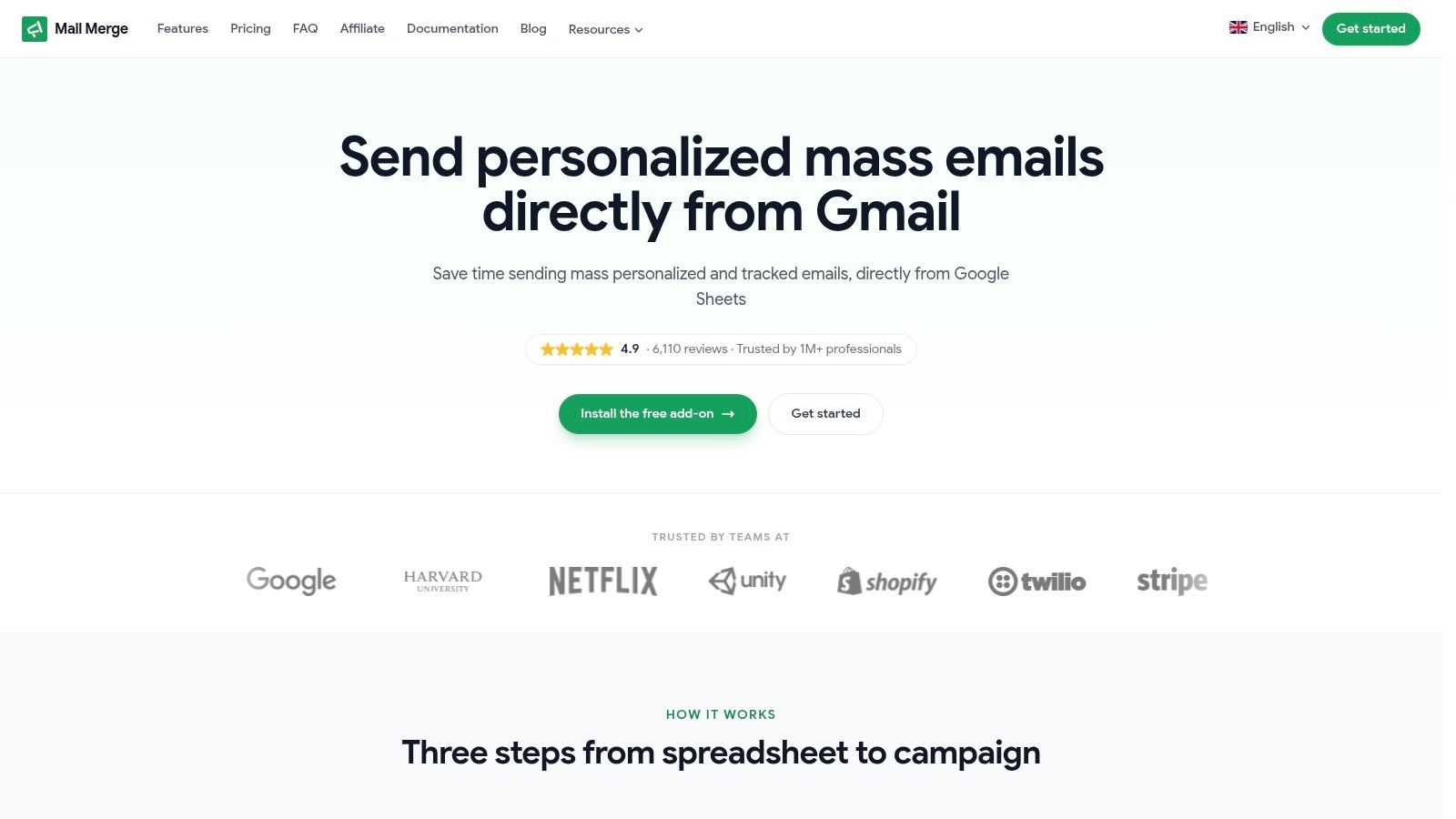
If you want to send personalized, trackable responsive emails directly from Gmail without moving into a full ESP workflow, Mail Merge for Gmail gives you a practical way to do it with Google Sheets data, custom templates, previews, and send tracking inside the tools your team already uses.
Ready to send your first campaign?
Install Mail Merge for Gmail from the Google Workspace Marketplace and send up to 50 personalized emails per day for free.
Install on Google WorkspaceMore reading
More from Tutorials
How to Clean Email List: Your 2026 Guide
Learn how to clean email list with our 2026 guide. Remove bounces & inactive users, run re-engagement campaigns to boost deliverability.
Outgoing Email Servers: A Guide to Better Deliverability
Understand outgoing email servers (SMTP) to fix deliverability issues. This guide explains how they work, common settings, security, and troubleshooting.
How to Whitelist an Email: A Sender's Guide for 2026
Learn how to whitelist an email to stop messages from going to spam. Our guide covers recipient steps and sender best practices for deliverability (SPF/DKIM).