


















Responsive Email Templates: Design, Code, and Deploy Guide
Build responsive email templates that render perfectly in Gmail and mobile clients. Learn coding best practices, testing workflows, and Mail Merge deployment.
80% of people delete an email if it doesn’t display well on mobile, and 43% mark promotional email as spam when it fails on smartphones, which is why responsive email templates stopped being a design preference and became an inbox survival issue. The business case got even clearer as adoption moved from 26% of B2C brands in 2014 to about 50% in 2016 for responsive design in email campaigns, while industry guidance also tied responsive layouts to 15% more CTR for mobile users and a 30% higher click rate for the first link in a responsive email versus a non-responsive one, all from the same mobile-first shift in behavior and expectation (mobile-friendly template guidance). If the email looks broken on a phone, the recipient doesn’t politely forgive the layout. They delete it, report it, or move on.
Why Responsive Email Templates Drive Engagement
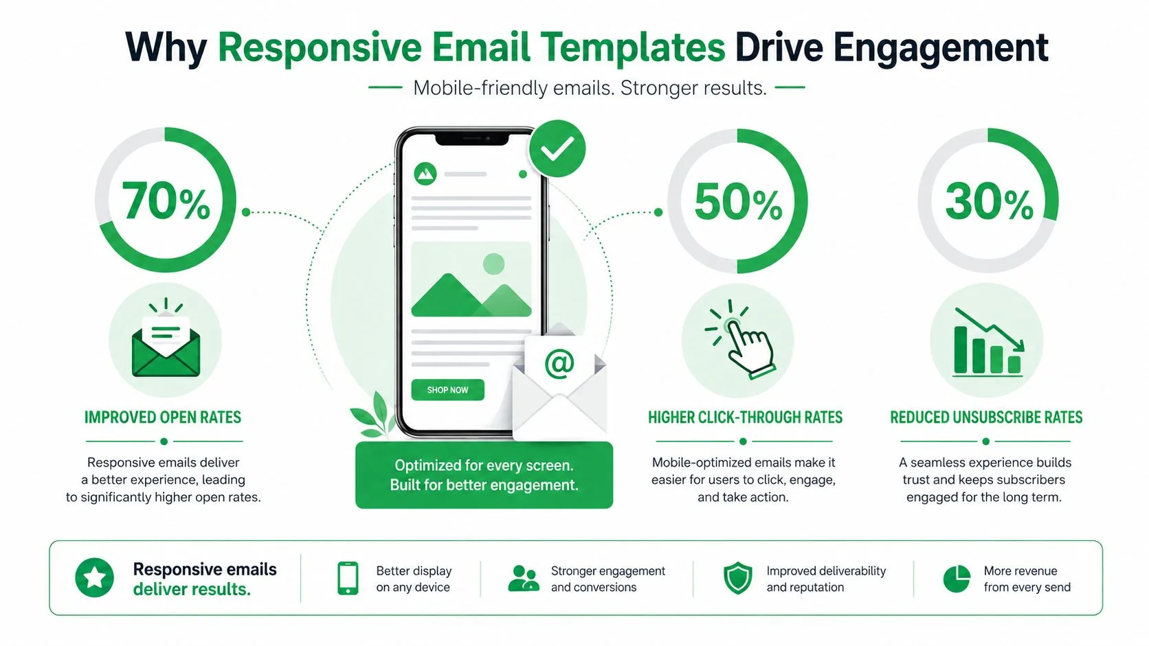
The strongest case for responsive email templates is practical, poor rendering changes what people do. When an email forces pinching, sideways scrolling, or broken CTAs, the message loses credibility before the copy even gets a chance. That makes mobile rendering an operational issue, not just a design one.
The same pattern shows up in usability research around mobile email behavior. Guidance tied responsive templates to 5%–15% more unique clicks from mobile users and a 24% increase in mobile clicks compared with non-responsive designs, while earlier findings on delete and spam behavior show what happens when the experience misses the mark (email usability findings). Responsiveness is not only about making the layout fit. It keeps the click path intact.
Why the shift became required
By the time responsive design reached roughly half of B2C brands, mobile-first email was no longer an edge case in major consumer markets (mobile-friendly template guidance). That matters because template choices follow audience behavior, not the other way around. Once more people read mail on small screens, any template that still assumed a desktop-first experience became a liability.
The practical effect is straightforward. Responsive templates do not create engagement on their own, but they remove friction that blocks engagement. The first link is easier to tap, the hierarchy is easier to scan, and the user does not have to fight the layout to get to the action.
For teams building campaigns at scale, list health is part of the equation too. A template that renders badly can suppress clicks and damage trust in the sender. That is why responsive design became a core operational standard rather than a design upgrade.
If you want a practical example of how responsive structure supports a real campaign format, the layout discipline used in top real estate email templates shows why the mobile version cannot be an afterthought. The same content that works on desktop has to stay legible and tappable on a phone, or the campaign loses value.
Building Responsive Layouts with Two-Layer CSS
The safest email builds still start with tables. That may feel old-school, but it holds up across a fragmented client mix where Gmail, Outlook, and older mobile apps do not honor the same CSS rules. The reliable pattern is a table-based HTML layout with inline CSS for broad support, then a second layer of embedded CSS and media queries for clients that can use them. For a practical breakdown of that structure, the responsive email design guide is a useful companion to the MailerToGo responsive guide.
Start with the structure that survives
A clean responsive template usually begins with a centered table wrapper and nested tables for content sections. Inline styles carry the defaults, such as font family, line height, image sizing, and padding, because those are the properties most likely to survive client stripping. The embedded CSS then handles the parts that can change, usually column behavior, spacing, and visibility rules at a mobile breakpoint.
Practical rule: if a style is critical to readability, set it inline first. Use the media query to improve the layout, not rescue it.
The same guide recommends triggering the mobile layout at about a 600px breakpoint, which is a sensible cutoff for emails that need to collapse from multi-column to single-column without making the desktop version too narrow (MailerToGo responsive guide). Fluid percentage-based widths help here because they let blocks shrink naturally instead of snapping into broken fixed widths on smaller displays.
A simple pattern looks like this in spirit, even if your final markup is more complex:
- Outer wrapper: centered table at full width
- Content container: fluid width with a desktop max width
- Columns: stacked by default on mobile, side by side on desktop
- CTAs: full-width or near-full-width buttons that stay tappable
Keep the CSS layer disciplined
Do not overload the embedded stylesheet with decorative details that your most fragile clients will ignore. Use it for layout shifts, image scaling, and spacing adjustments that improve the mobile experience. Let inline CSS carry the core presentation.
That approach reduces debugging because you know exactly what each layer is responsible for. Inline code keeps the fallback stable, and media queries refine the experience on clients that support them. If the template breaks, you can trace whether the issue came from the base structure or the responsive override, which saves time when you are testing across Gmail apps, webmail, and native mobile clients.
The result is not glamorous. It is dependable, and in email, dependable usually wins.
Mobile Accessibility Beyond Screen Size
Responsive templates can still fail on a phone. A layout may collapse cleanly from desktop to mobile and still be hard to tap, slow to scan, or packed so tightly that the message blurs together. Screen fit is only one part of the job.
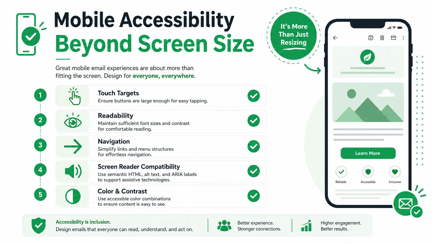
A practical mobile benchmark is touch targets around 44×44px or larger, with CTA styling that stays high-contrast so buttons remain usable on phones (Campaign Monitor mobile guide; ZeptoMail responsive template guidance). That target size matters because cramped links and tiny buttons turn a responsive template into a frustrating one. Users should not need to zoom in just to tap a primary action.
Readability and hierarchy matter as much as width
Strong mobile email guidance also points toward single-column layouts no wider than about 600-640px, with body text at 14-16px so content stays readable and easy to scan on major mobile clients (ZeptoMail responsive template guidance). Those numbers are useful guardrails, but they do not finish the job. The ultimate test is whether the message still has a clear hierarchy after the layout compresses.
A responsive template can still fail if it is technically fluid but not actually usable on a phone.
That is the part many template libraries skip. Accessibility is more than alt text or shrinking elements in proportion. It asks whether a thumb can hit the button, whether the headline still separates the message, and whether the content density turns into noise once the screen gets smaller.
For day-to-day design work, keep line lengths short, leave clear spacing between blocks, and use one primary CTA per screenful whenever possible. The goal is not minimalism for its own sake. It is legibility under pressure. Mobile readers are often moving, distracted, or reading in glare, so the template has to carry more of the burden with less room.
The same applies to inclusive design details that get missed until testing starts to fail. Color alone should not carry meaning, focus states should remain visible, and tap areas need enough breathing room that adjacent links do not blur together. The infographic below is a useful reminder of those mobile accessibility checks in practice.
Solving the Dark Mode Rendering Problem
Dark mode is where a lot of responsive email templates fall apart. The template can be perfectly fluid, fully tested on mobile widths, and still look wrong once Gmail or Apple Mail forces color inversion or partially restyles the message. The issue isn’t just aesthetics. It’s whether the message remains readable and on-brand after the client changes the rendering rules.
Recent practitioner guidance calls out this gap directly, because many responsive email resources still focus on tables, media queries, and breakpoints while barely addressing how dark mode changes the final output (Knak responsive HTML email templates). That leaves a real blind spot for teams that think responsive equals finished. It doesn’t.
Test both modes, not just one rendering path
The practical move is to review light and dark rendering before sending, especially on the clients your audience uses. Gmail and Apple Mail can transform the same design differently, which means a button that looks fine in a light theme may lose contrast once the client rewrites the colors. If your brand relies on subtle grays, thin borders, or image-based logos with transparent backgrounds, dark mode can expose those weaknesses fast.
The best defense is visual resilience. Use strong contrast, avoid depending on delicate color boundaries, and check whether the template still makes sense when the client inverts or alters your palette. If a component only works in one theme, it’s not fully designed.
Keep the template readable when the client rewrites it
The gap between technical responsiveness and actual usability becomes obvious. A layout can respond to the screen size and still fail the moment the operating system theme changes. That’s why some teams now treat dark mode as part of the core QA process, not an edge-case polish task.
A useful design habit is to ask one question before launch. If this template were auto-inverted, would the message still read cleanly in under a few seconds? If the answer is no, the template needs adjustment before it goes out. The same principle applies to on-brand styling, because forced color changes can flatten the visual identity even when the structure itself remains intact.
Pre-Deployment Testing Checklist
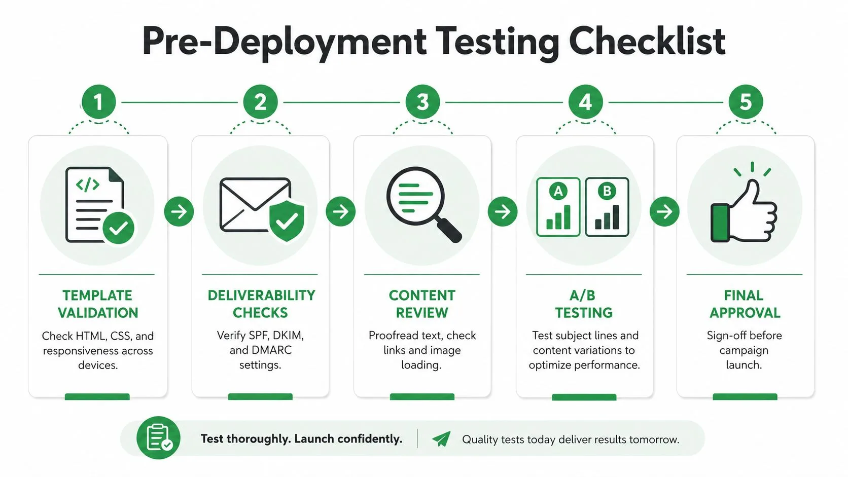
Testing has to cover more than “does it look okay on my screen.” A responsive email can pass a casual preview and still fail deliverability, break links, or render poorly in a client that strips important styling. MailGenius recommends checking SPF and DKIM, confirming that images load and links resolve, validating the exported HTML, and reviewing the final message on both mobile and desktop, including dark mode behavior (MailGenius responsive templates).
Start with deliverability, then move to rendering
If authentication is broken, the template never really gets a fair shot. That’s why SPF and DKIM verification belongs at the start of the QA flow, not after the creative review. Once authentication is clean, move into link checks and image loading, because a beautiful email that sends users to the wrong page is still a failed send.
The next layer is code validation. Exported HTML often picks up subtle problems during template editing, especially when blocks are moved, copied, or personalized. A bad closing tag or malformed table cell can ripple into layout failures that only appear in specific clients.
For a structured workflow, the most reliable sequence is:
- Template validation: check HTML, CSS, and responsive behavior across devices
- Deliverability checks: verify SPF and DKIM before launch
- Content review: proofread text, inspect links, and confirm image loading
- Client review: test on mobile, desktop, and dark mode
- Final sign-off: only launch after the template looks stable in the target clients
Use a controlled review process
A single reviewer usually misses something. The cleaner setup is a short checklist that someone on the email team can run the same way every time. That keeps the process repeatable and makes failures easier to diagnose.
If you need a practical reference for your own workflow, the email template testing guide is useful as a framework for cross-client review. It’s especially helpful when you’re trying to keep the QA process from turning into an ad hoc scramble before every send.
Deploying Templates in Mail Merge for Gmail
The cleanest way to deploy responsive email templates inside Gmail is to keep the structure stable and the personalization layer separate. In Mail Merge for Gmail, that usually means importing recipients from Google Sheets, choosing or building your template, then previewing before you send. The product is designed to send personalized, trackable campaigns from Gmail with delivery and engagement statuses written back to the spreadsheet, which makes the send log easy to review later.
Keep the template responsive while you personalize
Personalization should sit inside the template, not break the template. Mail Merge for Gmail supports subject lines, body content, CC/BCC, attachments, and custom HTML templates, so you can keep the responsive structure intact while adapting the message per recipient. That matters because a responsive design loses value if personalization forces brittle formatting.
The safest workflow is to finalize the layout first, then map fields from the spreadsheet into the right places. Keep the body copy scannable, preserve button spacing, and avoid inserting long personalized strings into places where they could disrupt the mobile hierarchy. If you need formatting-specific guidance for that stage, the mail merge formatting guide is the right place to sanity-check structure before you send.
Preview before you push
The send path is simple, but the preview matters. Mail Merge for Gmail lets you review the message before it goes out, which is where you catch issues like awkward personalization, broken spacing, or a CTA that wraps badly on small screens. That preview step is where a responsive template proves whether it’s ready for real recipients.
Use the spreadsheet as the operational record
The biggest deployment advantage is visibility. Per-row statuses like Sent, Opened, Clicked, and Replied are written back into the Google Sheet, so the team can see how the campaign performed without digging through separate tools. That makes it easier to compare template variations, identify delivery problems, and keep the workflow shareable across sales, recruiting, fundraising, or customer updates.
Mail Merge for Gmail also supports scheduling and team analytics sharing, which helps keep the send process coordinated when more than one person touches the campaign. If your team lives in Gmail and Google Sheets, that’s a practical way to deploy responsive templates without introducing a separate, heavy workflow.
If you want a straightforward way to send responsive templates from Gmail while keeping personalization, tracking, and spreadsheet-based reporting in one place, visit Mail Merge for Gmail. It handles the deployment side cleanly, so your team can focus on templates that stay readable on mobile, survive dark mode, and get tapped.
Ready to send your first campaign?
Install Mail Merge for Gmail from the Google Workspace Marketplace and send up to 50 personalized emails per day for free.
Get started for freeMore reading
More from Guides
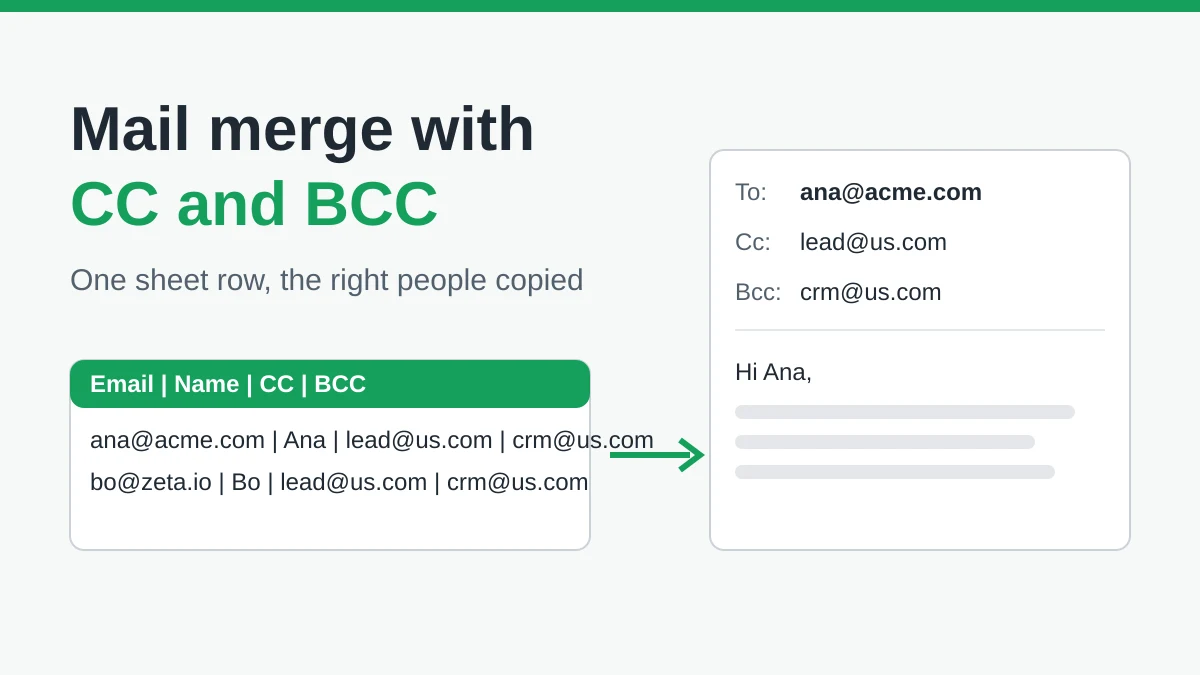
Mail Merge with CC and BCC in Gmail: Copy the Right People on Every Email
Learn how to run a mail merge with CC and BCC from Google Sheets, set up the columns, preview the result and see how copied recipients count toward your daily quota.
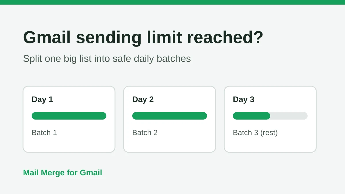
Gmail Sending Limit Reached: What It Means and How to Finish Your Campaign
Hit the Gmail sending limit reached error? Learn the real daily limits, when you can send again, and how to split a mail merge into safe daily batches.
Personalized Email Gmail: The Complete Guide
Master your personalized email Gmail workflow. Learn to merge Sheets data, track opens, and scale one-to-one outreach without leaving your inbox.