


















Master Layouts for Gmail: Boost Productivity in 2026
Master layouts for Gmail. Get step-by-step guidance on inbox types, reading panes, density, & multiple inboxes. Tailor views for sales, HR, educators, & mail
You open Gmail and the same problem is still there. The inbox is full, replies are buried, and the screen that’s supposed to help you work is slowing you down. For a lot of teams, the fix isn’t “more discipline.” It’s a better layout for Gmail.
That matters because Gmail’s interface stopped being a movable target in November 2022, when Google made the new Gmail user interface the standard experience and rolled it out gradually, with Scheduled Release domains potentially seeing features over up to 15 days in Google’s Workspace update. Since then, Gmail has leaned harder into controls like inbox type, density, reading pane, templates, and customizable layouts. The result is a bigger gap between a mailbox that looks tidy and a mailbox that enables a team to move faster.
For anyone doing sales, recruiting, education, or internal coordination, the essential question isn’t which screen looks prettiest. It’s which setup reduces missed replies, cuts scanning time, and keeps follow-up work from drifting. If you need a reference point for core Gmail workflow basics, start with this Gmail knowledge hub.
Introduction to Gmail Layout Evolution
Layout is often only noticed after something goes wrong. A recruiter misses a candidate reply because it sank below newsletters, or a sales rep wastes time jumping between tabs and labels to find hot leads. In both cases, the problem isn’t Gmail itself, it’s a mismatch between the mailbox structure and the work being done.
Google’s November 2022 shift made the new Gmail interface the standard, and it also removed the old “go back” option while preserving familiar controls like themes, inbox type, and quick settings Google Workspace update. That move mattered because Gmail stopped feeling like a temporary redesign and became the baseline for layout decisions. Once that happened, later features like reusable templates and more customized presentation made a lot more sense.
Why the modern layout matters
The important change isn’t cosmetic. It’s operational. If your team works from one chaotic default view, you spend time re-sorting the same messages every day. If you choose the right layout once and keep it aligned to your workflow, you spend more time replying and less time hunting.
Practical rule: pick the layout that makes your next action obvious. If you can’t tell what to do from the screen in front of you, the layout is working against you.
That’s why the rest of this guide focuses on layout choices that affect throughput and accuracy, not just appearance. Different teams need different defaults, and Gmail now gives you enough control to make those defaults matter.
Choosing Your Inbox Type for Productivity
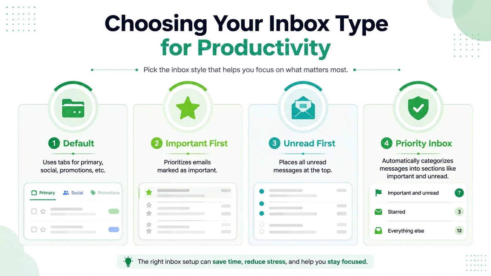
Gmail’s inbox types are useful because they separate different kinds of attention. Default works well when tabs already match your workflow, Important First surfaces messages Gmail thinks matter most, Unread First keeps fresh mail in view, and Priority Inbox groups messages into sections so you can move through them by urgency. Multiple Inboxes belongs in a separate category because it behaves more like a custom command center than a standard mailbox.
Match the inbox type to the job
Sales teams usually do better with Unread First when the day starts with cold outreach and follow-ups. That view pushes new replies to the top, which makes it harder to miss a live lead. HR teams often benefit from Priority Inbox because candidate communication tends to arrive in mixed bursts, and the inbox can separate must-read items from lower-priority noise.
Educators are often better served by Default tabs when announcements, promotions, and direct student emails need different handling. If the inbox is mostly relationship-driven, tabs can reduce mental friction because you know where certain messages belong before you open them. The trade-off is that tabs are only helpful if the team agrees on what belongs where.
A simple way to choose
Use this logic instead of guessing:
- Default tabs if your mail naturally separates into predictable categories like primary, social, and promotions.
- Important First if a small set of senders or threads consistently deserves immediate attention.
- Unread First if your biggest risk is missing fresh replies.
- Priority Inbox if you want Gmail to sort the stream into sections that support rapid triage.
The key is consistency. A mailbox that looks neat but changes behavior every week creates more mistakes than it solves. A steady inbox type, chosen for the actual work, keeps the team moving with less second-guessing.
Configuring Reading Pane and Message Density
The reading pane is one of Gmail’s most underrated speed settings because it changes how often you have to open and close messages. In a busy inbox, that alone can save a lot of friction. It also changes how much of the message list stays visible, which is why the right split depends on whether you value scan speed or screen space.
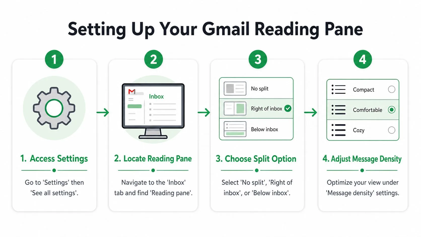
To turn it on, open Gmail, go to Settings, then See all settings. In the Inbox tab, find Reading pane, then choose No split, Right of inbox, or Below inbox. Right of inbox works well on wider screens, while Below inbox can feel more comfortable when you want the message and thread list stacked in a single flow.
Density is not a cosmetic choice
Under Message density, Gmail gives you Default, Comfortable, and Compact. Compact fits more messages on screen, which helps people who triage quickly. Comfortable is easier on the eyes when messages are longer or when a team spends long stretches inside Gmail.
For outreach, the message layout itself should stay simple. A single-column, mobile-first structure with one primary CTA, body text at 14–16 px, line-height around 1.4–1.6, and tap targets at least 44 × 44 px is the safest baseline for Gmail-based sending Sender’s email design guide. That matters because a dense desktop view and a readable message body are not the same thing. You can run a tighter inbox while still sending emails that are easy to read on phones.
Practical rule: if the inbox helps you move faster but the email itself is hard to read on mobile, you’ve only solved half the problem.
Make the choice by device use
If your team lives on laptops, try Right of inbox with a compact list. If reps move between desktop and mobile all day, use a simpler split and keep message bodies clean. The layout should support the work, not demand that everyone adapt to the layout.
Setting Up Multiple Inboxes and Custom Sections
When one list isn’t enough, Multiple Inboxes gives Gmail a more operational feel. It lets you build separate panes around search queries and labels, which is useful when different kinds of work need different queues. That’s why recruiters, account managers, and nonprofit coordinators often end up here.
Open Settings, then See all settings, go to Inbox, and switch the inbox type to Multiple Inboxes. From there, define panes with queries that match the work, such as is:unread label:VIP for urgent items or from:applicant@example.com for a specific hiring thread. If the panes are ordered badly, the whole setup feels messy, so put the most time-sensitive section first.
Keep the structure shallow
Shallow structures age better. Guidance on Gmail productivity recommends only three to five top-level labels and warns against deep hierarchies because they stop reflecting current priorities Keeping.com productivity tips. That’s not just a neatness rule, it’s a maintenance rule. Once labels become a maze, people stop trusting them.
A recruiter can keep one pane for new resumes, another for interview follow-ups, and a third for offer-stage replies. A sales team might separate hot leads, open opportunities, and customer escalation threads. The point is not to create more places for mail to live. The point is to make the next reply easier to find.
For a more detailed folder and label workflow reference, use this Gmail folder guide alongside your pane setup.
You can go too far, though. If every thread needs a manual move, your “system” becomes another job. That’s why Multiple Inboxes work best when the queries are obvious, the labels are light, and the team agrees on what belongs in each section.
Creating Templates and Integrating Mail Merge
Reusable templates turn Gmail from a one-off composer into a repeatable sending system. In 2023, Gmail expanded to a beta version of fully customizable layouts that let users tailor existing templates, reuse layouts across multiple campaigns, or create entirely new layouts Damson Cloud recap. That shift is useful because consistency in the message body matters just as much as inbox structure.
Build the message once, then reuse it
In Gmail, turn on Templates in Advanced settings, then save common subject lines and body blocks you reuse often. If you send similar outreach frequently, this keeps the formatting stable and cuts down on accidental drift. It also makes review easier because your team sees the same structure every time.
Gmail’s built-in mail merge starts from Compose. Add recipients in To:, click Use mail merge, turn Mail Merge on, then insert supported tags by typing @ and choosing @firstname, @lastname, @fullname, or @email before pressing Enter Google Help. Gmail sends individual emails, not a shared group message, so recipients don’t see one another’s addresses Prospeo’s 2026 guide. The same guide notes limits of 2,000 recipients per 24 hours for Google Workspace accounts and 500 recipients per 24 hours for free Gmail accounts.
If you’re using Mail Merge for Gmail, keep the workflow tied to Gmail drafts, then preview the template in the same reading pane you use for review. That makes layout decisions part of quality control, not a separate step. I’d rather catch awkward spacing, broken personalization, or a CTA that feels buried before send time than after replies start coming in.
A good template should look finished before the merge starts. If you still need to “fix” the layout after personalization, the template wasn’t ready.
Choose layout to support personalization
Templates work best in a calm, predictable interface. Use a reading pane that keeps the body visible while you check merge fields, and keep density low enough that you can spot subject line or formatting problems quickly. The more repeatable the layout, the easier it is to keep campaigns consistent across a team.
Practical Tips for Sales HR and Educators
Layout choices get real the moment a team starts living inside them. Sales wants fast prioritization, HR wants clean separation between stages, and educators want a view that doesn’t bury important student messages under general noise. The best setup is always role-specific.
Sales reps
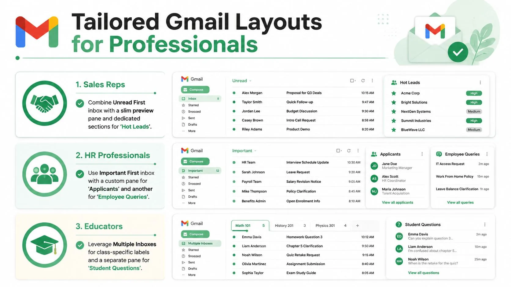
Use Unread First if your day starts with new replies, then add a slim preview pane so you can scan context without opening every thread. Keep a section for Hot Leads and another for open deals, so follow-up doesn’t depend on memory alone. The workflow should make it obvious which prospect is waiting.
HR teams
Priority Inbox usually fits candidate management better than a flat list. Separate panes for applicants, interview coordination, and offer letters help reduce drop-off when the hiring queue gets busy. That structure also keeps repeat communications from blending into one stream of “important later.”
Educators
Default tabs and a comfortable density view can work well when classroom messages naturally separate into announcements, assignments, and direct student questions. The goal is less visual strain and fewer missed threads. If your inbox handles both internal admin and student communication, use labels sparingly so the structure stays understandable at a glance.
A recent look at Gmail tips and buried features shows that layout is often treated like a cosmetic preference, even though it directly affects workflow and throughput Fox News tech coverage. That’s the mistake to avoid. The inbox is a working surface, not decoration.
Conclusion and Next Steps for Ongoing Optimization
The strongest Gmail setup is the one that matches the job in front of you. Inbox type should reflect how you triage, reading pane should match your screen space, density should fit your pace, and templates should keep repeated messages consistent. If those pieces line up, Gmail gets out of the way.
A useful habit is to test one change at a time. Switch an inbox type, use it for a week, then look at whether replies are easier to find and whether follow-ups feel less scattered. If you send campaigns or recurring sequences, compare how the same message feels in different layouts before locking in a default.
Keep the maintenance light. Labels that drift, panes that stop matching reality, and templates that age badly all create extra work. The point isn’t to build the most elaborate system, it’s to build the one the team will keep using.
For a simple review cycle, check three things: whether the inbox shows the right priorities first, whether the message view feels easy to scan on the devices you use most, and whether reusable layouts still match the way your team communicates. When those three hold up, the setup is doing its job.
A CTA for Mail Merge for Gmail.
Ready to send your first campaign?
Install Mail Merge for Gmail from the Google Workspace Marketplace and send up to 50 personalized emails per day for free.
Get started for freeMore reading
More from Guides
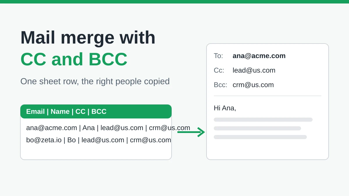
Mail Merge with CC and BCC in Gmail: Copy the Right People on Every Email
Learn how to run a mail merge with CC and BCC from Google Sheets, set up the columns, preview the result and see how copied recipients count toward your daily quota.
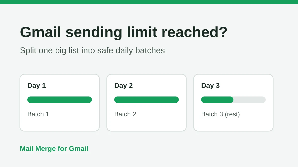
Gmail Sending Limit Reached: What It Means and How to Finish Your Campaign
Hit the Gmail sending limit reached error? Learn the real daily limits, when you can send again, and how to split a mail merge into safe daily batches.
Personalized Email Gmail: The Complete Guide
Master your personalized email Gmail workflow. Learn to merge Sheets data, track opens, and scale one-to-one outreach without leaving your inbox.