


















Master Campaign Performance Reporting in Google Sheets
Build effective campaign performance reporting dashboards in Google Sheets. Our step-by-step guide uses Mail Merge for Gmail to track and visualize results.

You send a campaign, refresh Gmail twice, then open the spreadsheet and realize you still don’t know what happened. Did people open it? Did anyone click? Which segment cared enough to reply? Most small teams don’t have a reporting problem because they lack data. They have one because the data sits in too many places, arrives too late, or never gets organized into something useful.
That’s where campaign performance reporting stops being an admin task and becomes a growth habit. A good report answers business questions, not just marketing questions. Which audience should get the next follow-up? Which subject line style is worth repeating? Which campaign deserves more time because it’s creating conversations?
For email outreach, “good” starts with a few basic signals. You need to know whether the message was sent, whether it was opened, whether someone clicked, whether they replied, and whether they unsubscribed. Those aren’t abstract KPIs. They’re the fastest route to diagnosing where your campaign is working and where it’s leaking opportunity.
The strongest setup I’ve seen for small businesses is also the simplest one. Keep the campaign list, engagement data, and dashboard inside Google Sheets so the reporting lives where the work already happens. That makes the spreadsheet more than a contact list. It becomes a live operating view of outreach performance, follow-up priority, and segment quality.
Introduction From Sending to Seeing
The hardest part of email outreach isn’t writing the campaign. It’s the silence after launch.
You’ve got a list. You’ve personalized the message. You’ve picked a send time that feels reasonable. Then the campaign goes out, and you’re left piecing together performance from scattered clues. A few replies land in Gmail. Someone on the team says a prospect mentioned the email on a call. The spreadsheet still looks static. That gap is where useful insight gets lost.
Campaign performance reporting fixes that by creating a feedback loop you can act on quickly. Instead of treating reporting as something you do at the end of the month, you use it during the life of the campaign. That changes how teams work. Follow-ups happen faster. Bad segments get spotted earlier. Winning messages don’t get buried under guesswork.
What good reporting actually answers
A useful report should tell you four things:
- Delivery reality: Did the campaign go out cleanly?
- Attention level: Are recipients opening the message?
- Action taken: Are they clicking or replying?
- Audience fit: Which list segment is engaging and which one is cold?
When those answers live in a Google Sheet, the reporting becomes operational. Sales, founders, recruiters, and coordinators can all look at the same data without waiting for a separate summary.
Practical rule: If a report doesn’t help you decide who to follow up with, what to rewrite, or what segment to pause, it’s not finished.
That’s why I like simple systems. They reduce delay. They also reduce cleanup. A sheet that updates campaign engagement directly is easier to trust than one that requires exporting data, pasting it into another tab, and hoping nobody broke a formula.
The shift from anxiety to control
Reporting often begins out of a desire for visibility. The practice continues because visibility creates control.
Once your sheet shows engagement row by row, each campaign stops feeling like a blast into the void. It becomes a measurable process. You can sort by replies, isolate engaged leads, flag unsubscribes, and decide your next move from one place. That’s the point where outreach gets calmer, faster, and much easier to improve.
Choosing KPIs That Actually Drive Decisions
A campaign can look busy in Gmail and still miss the goal.
I learned that the hard way with outreach tracked in Google Sheets. One sequence showed strong opens, a fair number of clicks, and almost no replies. The subject line was doing its job. The offer was not. If I had reported only top-line engagement, I would have called that campaign a win and sent the same message again.
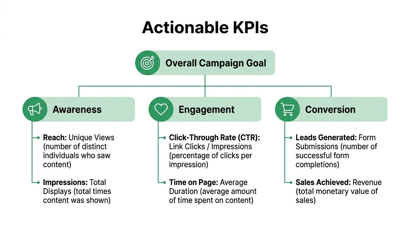
Start with the conversion goal
Choose the KPI that matches the reason the email exists. In a Google Workspace setup, that means deciding what success looks like before Mail Merge for Gmail sends a single message and before the sheet starts filling up with engagement data.
A few common examples:
- Sales outreach: positive replies or booked meetings
- Customer update: clicks to a renewal or account page
- Recruiting email: replies from qualified candidates
- Event invite: registrations from the target segment
LinkedIn’s guidance on measuring campaign success makes the same point. Campaign measurement works better when the report is tied to conversion quality instead of surface-level activity.
That trade-off matters. Opens are easier to get than replies. Clicks are easier to get than booked calls. If the business goal is conversations, then replies belong at the top of the report, even if they look less impressive than open rate.
Use a simple KPI hierarchy
In a Mail Merge for Gmail and Google Sheets workflow, I keep KPIs in three levels so the sheet stays useful under pressure.
| Level | Metric | Why it matters |
|---|---|---|
| Primary | Replies, registrations, or conversions | Shows whether the campaign produced the intended result |
| Secondary | Clicks | Shows whether the copy and CTA created enough interest to act |
| Diagnostic | Opens, unsubscribes, send status | Helps identify subject line issues, list problems, or audience mismatch |
This structure keeps reporting honest. A campaign with high opens and weak replies usually needs a new offer, tighter targeting, or a better first paragraph. A campaign with low opens may need a different subject line or cleaner list. Different KPI patterns lead to different actions.
For outreach emails, a short KPI list is enough:
- Opened: useful for checking subject line strength and list fit
- Clicked: useful when the email asks readers to visit a page
- Replied: the strongest signal for direct outreach
- Unsubscribed: a warning sign for targeting or message fit
For a closer look at which outreach metrics deserve the most attention, review this guide to cold email performance metrics.
If you want a clean framework for aligning campaign metrics with leadership priorities, this practical guide for leaders on OKR metrics is a helpful reference.
Benchmarks are useful. Your trend line matters more.
Benchmarks can help set expectations, especially for a new campaign or a new list. They should not run the reporting process.
What matters more in a Sheets-based workflow is whether performance improves after a change you made. If replies rise after you shorten the ask, that is a result worth keeping. If a segment opens often but never responds, that segment may be curious but unqualified. If unsubscribes spike after a follow-up, the cadence may be too aggressive.
That is why I avoid stuffing the report with every metric available. Each KPI should support a decision. Keep, change, pause, resend, or follow up.
Choose metrics your team can act on
The test is simple. Can someone look at the sheet and know what to do next?
If the answer is no, the KPI probably does not belong in the main view. In small teams, reporting has to help with execution, not just review. A founder, recruiter, or sales lead should be able to open the Google Sheet and quickly see which campaign deserves another send, which segment needs a rewrite, and which rows should get personal follow-up first.
That is the standard I use. Fewer KPIs, clearer decisions, faster improvement.
Structuring Your Google Sheet for Automated Reporting
Most reporting problems start long before the first email goes out. They start in a messy sheet.
If column names are inconsistent, segments are mixed together, or follow-up notes live in somebody’s head, your campaign performance reporting will be unreliable from day one. The fix is simple. Build the sheet like you expect to report from it, not just send from it.
A structure that stays clean under pressure
A practical Google Sheet usually needs four column groups.
-
Recipient identity
- First Name
- Last Name
- Company
- Job Title
-
Segmentation
- Lead Source
- Customer Type
- Industry
- Region
- Campaign Name
-
Personalization and follow-up
- Custom Intro
- Offer Type
- Notes
- Follow-up Owner
- Next Action
-
Reporting fields
- MERGE_STATUS
- Last Engagement
- Reply Category
- Conversion Outcome
That layout does two jobs at once. It powers personalized sending, and it gives you enough structure to analyze results by meaningful slices later.
Why the MERGE_STATUS column matters
The most useful reporting column in a Gmail and Google Sheets workflow is MERGE_STATUS. It becomes the operating signal for each row.
In practice, that column lets you see where each contact stands without opening individual threads. A row can move from sent to engaged, and your sheet starts acting like a lightweight CRM for the campaign. You can filter it, count it, chart it, and assign follow-up actions from it.
Clean reporting starts with clean labels. If one tab says “Webinar Leads” and another says “webinar lead list,” you’ve already made the analysis harder than it needs to be.
Use formulas that support review
You don’t need advanced Sheets skills to make the tab report-ready. A few helper columns go a long way.
For example, create a simple engagement flag:
=IF(OR(M2="OPENED",M2="CLICKED",M2="REPLIED"),"Engaged","No engagement")
If your status column uses a different letter, adjust accordingly. The point is to create plain-language classifications that make filtering easier for non-technical teammates.
A follow-up priority column also helps:
=IF(M2="REPLIED","High",IF(M2="CLICKED","Medium",IF(M2="OPENED","Low","None")))
This is not complex scoring. That’s why it works. Most small teams benefit more from a usable priority view than from a complicated lead model nobody maintains.
Build reporting into the sheet, not around it
I recommend keeping one raw data tab and one cleaned working tab.
| Tab | Purpose | Rule |
|---|---|---|
| Raw Campaign Data | Original recipient and campaign output | Don’t edit manually unless fixing obvious data errors |
| Working View | Formulas, tags, cleanup fields, ownership | Safe for filters, helper columns, and dashboard references |
That separation protects the underlying campaign data and keeps dashboards from breaking when someone sorts the wrong range.
If you’re handling larger reporting volumes, Adobe’s reporting guidance warns that calculation time should stay under 5 minutes generally, or 60 seconds during design with small data volumes, and the data should not exceed 10 million lines in a report. Their reporting best practices for Adobe Campaign also recommend pre-aggregating data rather than doing heavy post-processing inside the report itself. The lesson applies to Sheets too. Don’t build a dashboard that recalculates everything from scratch if a helper tab can simplify the logic.
Watch the send limits if you work in Gmail all day
For teams that run outreach directly from Gmail, the limits matter because they shape how you batch campaigns. Standard free Gmail accounts have a hard cap of 500 emails per rolling 24-hour period, and each recipient counts separately according to this explanation of the Gmail send limit.
Mail merge inside Gmail has a separate recipient cap of 1,500 recipients per day, based on the user discussion documenting the Google Sheets mail merge limit. There are also workflow constraints. Gmail mail merge can’t be used with Reply, Forward, Schedule Send, or Confidential Mode, and BCC recipients count double toward the daily total, as shown in this video explanation of Gmail mail merge restrictions.
Those aren’t reporting metrics, but they influence reporting quality. When you know your operational limits, you batch lists more cleanly, name campaigns more consistently, and avoid mixing unrelated sends in the same sheet.
Building Your Live Dashboard in Google Sheets
You send a batch in the morning, open Sheets after lunch, and need two answers fast. Is this campaign working, and who needs follow-up right now?
That is the job of the dashboard tab.
In a Google Workspace setup built around Mail Merge for Gmail and Google Sheets, the dashboard does not need BI software or a pile of connectors. It needs to pull cleanly from the working tab, show the few numbers that drive decisions, and stay readable enough that anyone on the team can use it without breaking formulas.
Start with a separate tab called Dashboard. Keep raw rows, helper columns, and dashboard output in different tabs. That separation saves time later when you need to update formulas or add a new campaign view.
Build the summary block first
I build the top row for speed, not presentation. If the first screen shows sends, opens, clicks, replies, unsubscribes, and the matching rates, the dashboard is already useful.
A simple layout works well:
| Metric | Formula example |
|---|---|
| Total Sent | =COUNTIF('Working View'!M:M,"SENT") |
| Total Opened | =COUNTIF('Working View'!M:M,"OPENED") |
| Total Clicked | =COUNTIF('Working View'!M:M,"CLICKED") |
| Total Replied | =COUNTIF('Working View'!M:M,"REPLIED") |
| Total Unsubscribed | =COUNTIF('Working View'!M:M,"UNSUBSCRIBED") |
If your Mail Merge for Gmail workflow writes events into separate columns, switch to COUNTIFS so each metric points to the right field. The exact formula matters less than one rule. Count events the same way every time, or week-to-week comparisons become noisy.
Then calculate the rates from total sent:
- Open Rate: opens / sent
- CTR: clicks / sent
- Reply Rate: replies / sent
- Unsubscribe Rate: unsubscribes / sent
Format the rate cells as percentages and round them to one decimal place. That small cleanup makes the dashboard easier to scan during a quick review.
Add context without turning benchmarks into goals
A dashboard is more useful when the team knows what looks healthy and what needs work. As noted earlier, industry benchmarks can help set that context, including HubSpot’s published averages for open rate and click-through rate.
Use those numbers as a reference point, not a target you chase blindly. A cold outbound campaign sent from Gmail to a tight prospect list behaves differently from a customer update sent to existing contacts. If opens are strong but replies are soft, I review message intent and call to action before I touch the subject line. If opens are weak across the board, I check audience fit, timing, and whether the campaign naming in Sheets grouped the right send together.
Good reporting shortens diagnosis time.
Use pivot tables to find the real winners and losers
Total performance hides uneven segments. One lead source can carry the entire campaign while another burns through sends with no replies.
Create a pivot table from the working tab and break out results by fields such as:
- Lead Source
- Industry
- Region
- Campaign Name
- Customer Type
A simple Google Sheets setup beats a cluttered report. You can change the question in seconds.
For outbound campaigns, I usually start with rows by Lead Source and values for replies and reply rate. For customer communications, rows by Customer Type with clicks and unsubscribes often reveal the problem faster. If one segment underperforms, filter the raw rows and inspect the actual copy, offer, and send timing instead of debating theory in a meeting.
If you want examples of clean operational layouts, this overview of nonprofit operations dashboard features is useful because it shows how a dashboard can stay practical without crowding the page.
Add charts that answer one question each
Charts help when they make a pattern obvious. They hurt when they duplicate the summary block.
A practical setup:
- Bar chart by segment for replies or clicks
- Pie chart for current status mix
- Line chart or sparkline for campaign progression if you log dates
For a quick trend indicator inside a cell, use:
=SPARKLINE(B2:G2)
That works well when each column represents a day of campaign activity. If you want a cleaner visual setup, this guide on how to make a graph in Google Sheets covers the basics without overcomplicating it.
Here’s a walkthrough worth watching if you want to see the dashboard process in action:
Keep the layout useful under daily use
The best dashboards survive real use by busy teams. That usually means fewer widgets, larger labels, protected formula cells, and filters that match how the team operates.
In my own Sheets, I freeze the summary block at the top, keep pivot outputs on the right side, and leave one small action area for filters or campaign selectors. A founder can open the file and check performance in 30 seconds. A rep can filter for replied leads and work follow-ups. An operator can spot unsubscribes or weak segments before the next batch goes out.
That is enough for a live dashboard. It stays inside Google Workspace, works with Mail Merge for Gmail, and gives you current campaign visibility without adding another tool to manage.
Automating and Sharing Your Campaign Insights
A dashboard nobody sees is just a private hobby. Reporting starts creating value when it reaches the people who need to act on it.
For most small teams, sharing from Google Sheets is enough. Give leadership view-only access so the numbers stay stable. Give campaign operators comment or edit access if they’re tagging replies, assigning follow-ups, or updating conversion outcomes.
Use simple automation where speed matters
Adobe for Business reported that organizations implementing automated performance reporting see a 22% increase in campaign ROI compared with teams relying on manual spreadsheet analysis, largely because they can detect anomalies much faster in their State of Performance Marketing report.
That doesn’t mean you need a full reporting stack. Small teams can automate just the handoff layer.
A practical setup might look like this:
- Weekly leadership snapshot: Use Google Apps Script to export the dashboard as a PDF and email it on a schedule.
- Reply alert: Use Zapier or a similar workflow tool to send a Slack message when a new reply appears in the sheet.
- Owner reminders: Trigger a note for rows marked replied but missing a next action.
Read the dashboard like an operator
Automation is only useful if it leads to action. I like to think in simple if-then terms.
- If opens are low, review subject lines and segment quality before writing a new follow-up.
- If opens are healthy but clicks are weak, rewrite the body and tighten the CTA.
- If clicks are strong but replies are scarce, the offer may be interesting but not conversation-worthy.
- If unsubscribes cluster in one segment, stop treating that segment like the rest of the list.
Fast reporting matters because campaigns rarely fail all at once. They fail in small signals first.
Share context, not just totals
When you send a dashboard to the team, add one short note. What changed, why it matters, and what happens next. That habit keeps reporting from turning into passive observation.
A good summary sounds like this: replies are concentrated in partner leads, unsubscribes are coming from the newsletter import, and the next campaign will split those audiences. Short, clear, actionable.
How to Interpret Results and Plan Your Next Campaign
Once the data is visible, interpretation is the essential skill. Many teams don’t need more metrics. They need better reading habits.
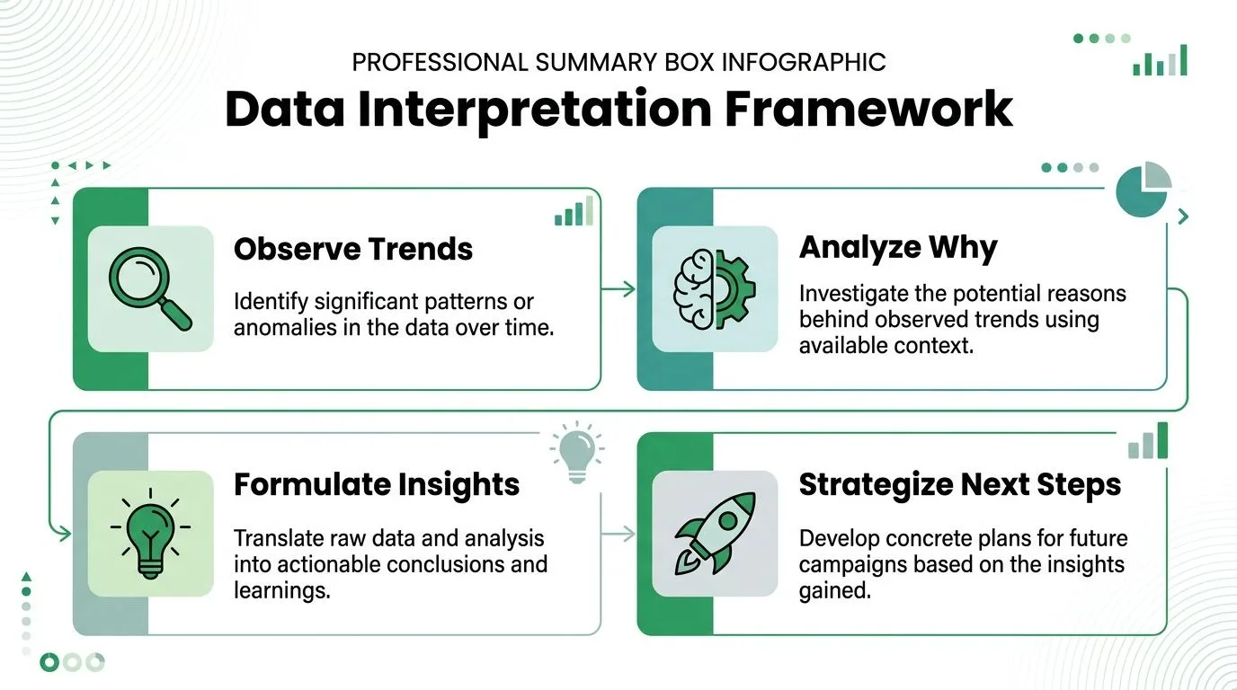
Read patterns, not isolated numbers
A single campaign can mislead you. A trend across campaigns usually tells the truth.
If one message gets opened often but rarely earns clicks, the issue probably isn’t audience quality. It’s more likely a copy problem. If one segment replies consistently across different campaigns, that’s not luck. That segment deserves its own messaging and cadence.
A useful mental model is:
- Observe what changed
- Ask why it changed
- Turn that into a working insight
- Apply the insight in the next send
A few diagnosis rules that hold up
Here are the patterns I use most often:
- Low open activity: Look first at subject lines, send timing, and list relevance.
- Strong opens with weak clicks: The message got attention but the body didn’t create momentum.
- Clicks without replies: Interest exists, but the ask may be too indirect or the landing step too weak.
- Replies from one segment only: Split future campaigns and write specifically for that segment.
- Unsubscribes after a particular message type: The promise in the email may not match what the audience expected from you.
This is also where attribution discipline matters. A 2025 Gartner study found that 68% of campaign revenue is misattributed when using last-click reporting alone, which the Cometly analysis on campaign performance reporting gaps highlights. For email teams, that’s a reminder not to give all the credit to the final click. Track replies and downstream conversions back to the specific outreach that influenced them.
Plan the next campaign from evidence
The next campaign should come from one or two clear hypotheses, not a full rewrite of everything.
| What you saw | What to test next |
|---|---|
| Weak opens | New subject line angle and tighter segmentation |
| Good opens, poor clicks | Stronger first paragraph and one clearer CTA |
| Good clicks, weak replies | More direct ask or a more relevant offer |
| Uneven segment results | Separate campaigns by audience type |
If you want a broader view of how smaller organizations approach channel and campaign choices, this resource on digital marketing strategies for SMEs is a helpful companion.
For email-specific visibility, tracking opens is often the first useful diagnostic layer, and this guide on how to track email open is a practical next read.
Don’t optimize the whole system at once. Change one meaningful variable, watch the reporting, and let the next campaign earn the next decision.
Conclusion Stop Guessing and Start Growing
Campaign performance reporting doesn’t need a BI team, another subscription, or a complex data pipeline. It needs a clean sheet, consistent fields, and the discipline to track what leads to action. When your reporting lives inside Google Sheets, outreach gets easier to manage and easier to improve. You stop sending into the dark. You start seeing what opens, what gets clicked, what earns replies, and what should happen next.
If you want to run personalized outreach and keep reporting inside Google Workspace, Mail Merge for Gmail is built for that workflow. It lets you send trackable campaigns from Gmail using Google Sheets data, then write engagement statuses like Sent, Opened, Clicked, and Replied back to the sheet so your reporting stays visible, shareable, and easy to act on.
Ready to send your first campaign?
Install Mail Merge for Gmail from the Google Workspace Marketplace and send up to 50 personalized emails per day for free.
Get started for freeMore reading
More from Guides
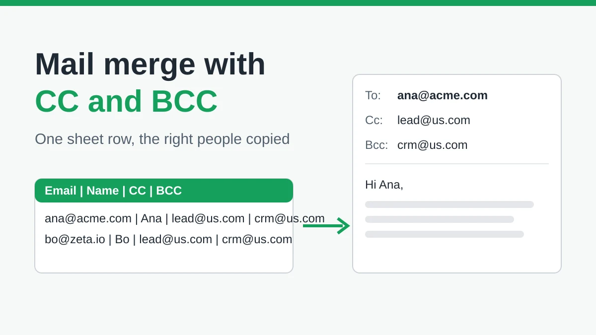
Mail Merge with CC and BCC in Gmail: Copy the Right People on Every Email
Learn how to run a mail merge with CC and BCC from Google Sheets, set up the columns, preview the result and see how copied recipients count toward your daily quota.
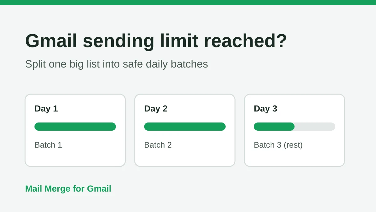
Gmail Sending Limit Reached: What It Means and How to Finish Your Campaign
Hit the Gmail sending limit reached error? Learn the real daily limits, when you can send again, and how to split a mail merge into safe daily batches.

Personalized Email Gmail: The Complete Guide
Master your personalized email Gmail workflow. Learn to merge Sheets data, track opens, and scale one-to-one outreach without leaving your inbox.